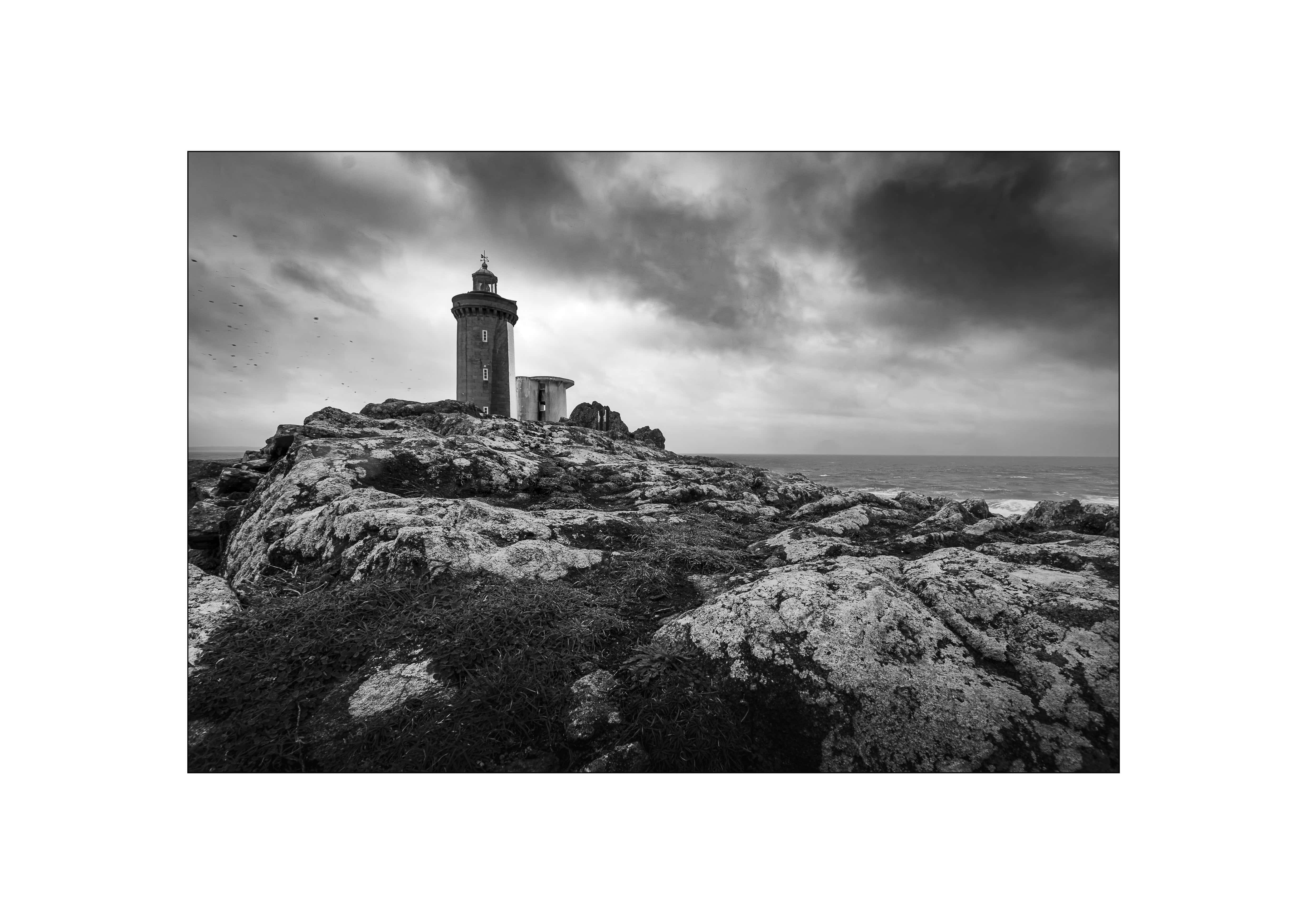
Practical photography tips written by a working landscape photographer. Composition, exposure, light management, and field techniques for intermediate photographers shooting outdoors.

  • A landscape photographer’s guide to reading, chasing, and surviving autumn storms on the North Atlantic.

    A landscape photographer’s guide to reading, chasing, and surviving autumn storms on the North Atlantic.

    Field Craft · Autumn 2026

    A landscape photographer’s guide to reading, chasing, and surviving autumn storms on the North Atlantic.

    There is a particular kind of light that only a storm can make. It is not the soft, forgiving glow of a calm golden hour. It is harder, stranger, more fleeting — a shaft of sun tearing through a bruised sky onto a sea still white with fury. On the Atlantic coast, where I have photographed for more than forty years, this is the light I wait all year for. And autumn is when it comes.

    This year, it may come more often than usual.

    i · the season

    An exceptional autumn on the North Atlantic

    The 2026–27 season is shaping up to be meteorologically remarkable. Forecasters are pointing to an exceptionally strong El Niño — possibly one of the strongest in the reliable satellite record — developing through autumn and peaking in early winter. For the North Atlantic, the practical consequence is a more vigorous, more oceanic westerly flow: deeper moisture streaming off the ocean, above-average autumn rainfall across much of Europe, and an active procession of depressions marching in from the west.

    A word of honesty here, because I would rather you trust me than impress you: El Niño is a Pacific phenomenon, and it does not directly “cause” Atlantic storms the way a match causes a flame. Its documented tendency is even to suppress tropical activity in the Atlantic. What matters for us — the coastal photographers of Brittany, of Scotland, of the whole western seaboard — are the extratropical depressions of autumn and winter, the true “Atlantic storms.” And the signal this year is for a strengthened westerly flow feeding them. In plain terms: an agitated autumn, in the context of an extraordinary El Niño. That is reason enough to sharpen your weather-reading and ready your gear.

    So let us treat this less as a photography article than as a field-craft one. Because with storm light, the photograph is the easy part. The hard part is being in the right place, at the right moment, prepared — and safe.

    ii · reading the weather

    Reading the birth of a depression

    Most photographers check the forecast the night before and hope. The ones who consistently come home with storm light do something different: they watch weather systems form, days out, and position themselves deliberately. You do not need a meteorology degree. You need to learn to read three things.

    The shape of the beast

    A North Atlantic depression is a great wheel of air turning anticlockwise (in the Northern Hemisphere) around a low-pressure centre. The lines on a pressure chart — isobars — are your single most important tool. The rule is simple and it never lies: the closer the isobars are packed together, the stronger the wind. Tight isobars mean drama; widely spaced ones mean a quiet day.

    Anatomy of a North Atlantic Depression Plan view — a mature extratropical cyclone spinning over the ocean isobars packed tight = strong wind L low-pressure centre warm front cold front warm sector (mild, humid air) rotation: anticlockwise (Northern Hemisphere) The closer the isobars, the fiercer the wind — and the drama for the lens.
    Anatomy of a mature depression: isobars, rotation, and the two fronts that swing around the low.

    Around that centre swing two fronts. The warm front (drawn with rounded bumps) arrives first, bringing thickening cloud and steady rain. Behind it lies the warm sector — mild, humid, usually murky and uninteresting to photograph. Then comes the cold front (drawn with triangles), often the most violent part: squalls, downpours, a sudden wind shift. And it is just behind the cold front that the magic waits.

    Watching it being born

    The satisfying part is catching a system while it is still forming, out over the ocean, two or three days before it reaches you. Cyclogenesis — the birth of a depression — follows a recognisable sequence.

    Spotting a Depression Being Born Three stages a photographer learns to read on a surface pressure chart 1 · The Wave A small kink appears on the polar front. Barely there — but it’s the seed. Watch it 24–48h out. 2 · Deepening L Closed isobars form and tighten. Central pressure drops fast. >24 hPa/24h = “bomb” 3 · Mature & Landfall L Fronts wrap in. This is when it hits the coast — plan your position now. Be in place, be safe. Free charts to practise on: national met services, and model viewers like Windy (ECMWF / GFS layers)
    The three stages of cyclogenesis, as they appear on a surface pressure chart.
    1. The wave. A small kink appears in the isobars along the polar front. It looks like nothing. It is the seed.
    2. Deepening. Closed isobars form around a low and begin to tighten as the central pressure falls. If the pressure drops more than about 24 hPa in 24 hours, meteorologists call it explosive cyclogenesis — a “weather bomb.” These are the systems that produce the most spectacular, and most dangerous, coastal conditions.
    3. Mature and landfall. The fronts wrap around the centre and the system slams into the coast. By now your decision is made — you are either in position, or you have missed it.

    Where to watch all this, for free: your national meteorological service publishes surface pressure charts and forecast charts several days ahead. Model viewers such as Windy let you flick between the ECMWF and GFS models and overlay wind, pressure, and precipitation — I use it constantly in the field. Learn to compare the two models: when they agree on a system three days out, confidence is high; when they diverge, stay flexible.

    A note on the charts in this article. The diagrams here are my own schematics, drawn to teach the concepts cleanly. When you illustrate your own planning — or your own videos — pull the live charts from your national met service or a viewer like Windy and screenshot those. Nothing teaches faster than watching a real system evolve against these three stages.

    When exactly is the light?

    Here is the secret that separates the keepers from the wasted trips. The best light of a storm is almost never during the storm. It is in the clearance behind the cold front — that narrow window when the cloud breaks, the sun drops low beneath the departing wrack, and the sea is still heaving and white. Rainbows live here. So does raking, low-angle light on wet rock.

    Where the Light Lives: A Front in Cross-Section The system moves right to left overhead — read it as a timeline of your shooting day coastline BEFORE high cirrus, falling pressure WARM FRONT thickening cloud, steady rain WARM SECTOR murky, mild COLD FRONT squalls, downpour THE GOLDEN WINDOW Just behind the cold front: breaking cloud, low sun, rainbows, raking light on a still-wild sea. system tracks this way — so your day runs right → left
    Read this cross-section as a timeline of your day. The golden window opens in the sunlit air trailing the front.

    The system passes overhead from right to left, and your golden window opens on the left, in the ragged, sunlit air behind the front. Watch the barometer — a rising pressure after a deep low is your cue that the clearance is coming. Be set up before it arrives. It can last ten minutes.

    iii · what to bring

    Gear for autumn storm photography: what to bring and wear

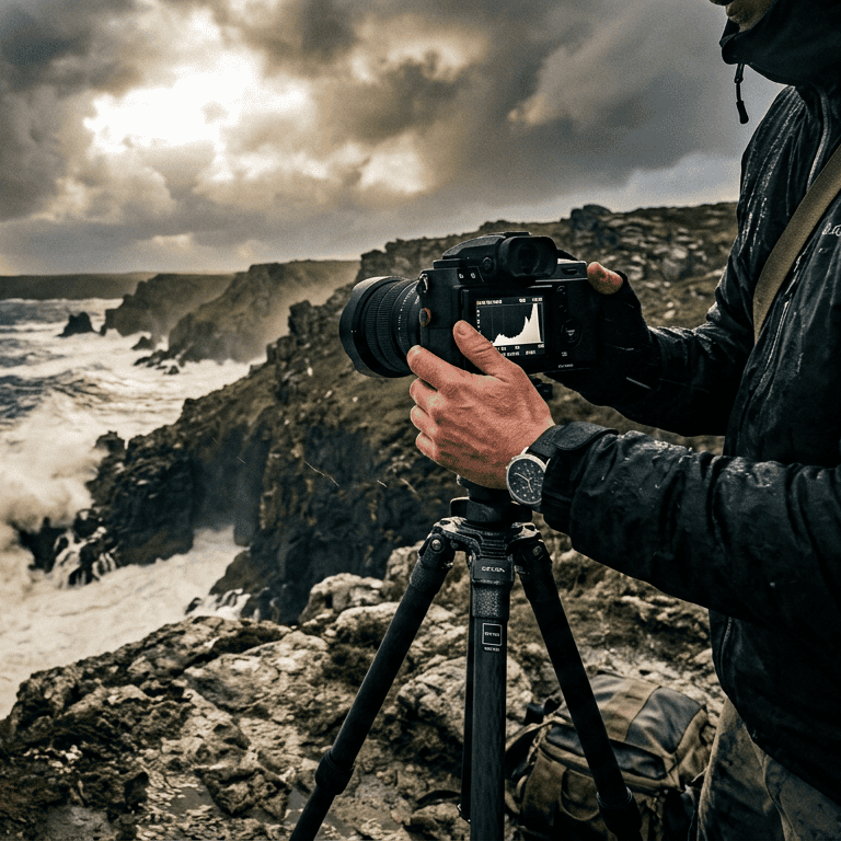
    Storm photography is equipment-hostile. Salt, spray, sand, driving rain, and violent wind will find every weakness in your kit and your clothing. Two categories matter equally, and beginners almost always under-invest in the second.

    The camera kit

    • A weather-sealed body and lenses. Not essential, but it buys peace of mind. If your gear isn’t sealed, a rain cover becomes mandatory, not optional.
    • Rain protection for the camera. A proper rain sleeve, plus a stack of microfibre cloths in a sealed pocket to keep the front element clear. In heavy spray you will be wiping the glass every few seconds.
    • A genuinely sturdy tripod — and a way to weight it. Wind is the enemy of sharpness. Hang your bag from the centre column, spread the legs low, and brace it. In real gusts, keep a hand on it.
    • Filters. A polariser to cut glare off wet surfaces and deepen a broken sky; ND filters if you want to smooth the sea into mist and render motion in the waves.
    • Lens choice. A wide angle for the sweep of sky and shore; a telephoto to isolate a single sunlit wave or a shaft of light on distant water. Storm light rewards the long lens more than people expect.
    • Spare batteries, kept warm. Cold and wind drain them fast. Inside pocket, close to the body.
    • Sealed bags for everything, and a plan for drying gear thoroughly the moment you’re back.

    What to wear — this is not an afterthought

    You cannot make good pictures if you are frightened, frozen, or soaked to the skin. Dress in three layers:

    • Base layer: merino or synthetic, never cotton. Cotton holds water and chills you.
    • Mid layer: fleece or down for warmth.
    • Shell: a genuinely waterproof, windproof jacket and trousers — not showerproof, waterproof. On an exposed Atlantic headland in a gale, the difference is everything.

    Add: waterproof boots with real grip (wet rock and weed are lethally slippery), gloves you can still operate dials in, a warm hat, and if it’s truly wild, eye protection against wind-driven spray and sand. A dry bag with a spare warm layer and a hot drink can turn a miserable retreat into an extra hour in the field.

    iv · staying alive

    Safety rules for coastal autumn storm photography

    I want to be blunt, because every year the sea takes people who came for a photograph. Everything below is non-negotiable.

    • Never turn your back on the sea. Rogue waves are real, they are far larger than the prevailing swell, and they arrive without warning. Watch the water constantly. If you’re setting up a shot, have someone watching the sea for you.
    • Know the tide. Study the tide tables before you go, and understand where a rising tide can cut you off. A photogenic rock platform at low water becomes a trap two hours later. Storm surge can push the water far higher than the predicted tide.
    • Respect the wind. Strong gusts on a cliff edge or a slick jetty can put you off your feet. Stay well back from edges. Assume the wind can knock you down, because it can.
    • Scout in advance, in daylight and calm. Know your ground before you shoot it in a gale. Identify your escape route and safe standing position before conditions turn.
    • Tell someone your plan — where you’re going and when you’ll be back — and carry a charged phone in a waterproof case.
    • Trust the flinch. If a location feels wrong, it is wrong. Leave. The light will come again; you will not.

    No image is worth a life. Make that your first rule and the rest of storm photography becomes not reckless but deeply rewarding.

    v · the reward

    The reward

    When it all comes together — when you’ve read the system three days out, positioned yourself behind a clearing cold front, braced your tripod against the wind, and the sun breaks low across a raging sea — you understand why we do this. Storm light is a gift the calm days cannot give. It is elemental, and it is brief, and it makes photographs that stop people.
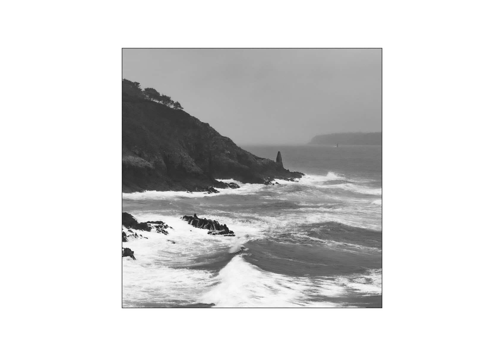


    The photograph is not taken. It is received.

    Chase it in the field

    Storm Special Finistère

    26–30 October 2026 · small group · all-inclusive

    Five days on one of the most dramatic coastlines in Europe, built entirely around chasing exactly the conditions described in this article — guided, hands-on, in the heart of the season.

    Details & waiting list
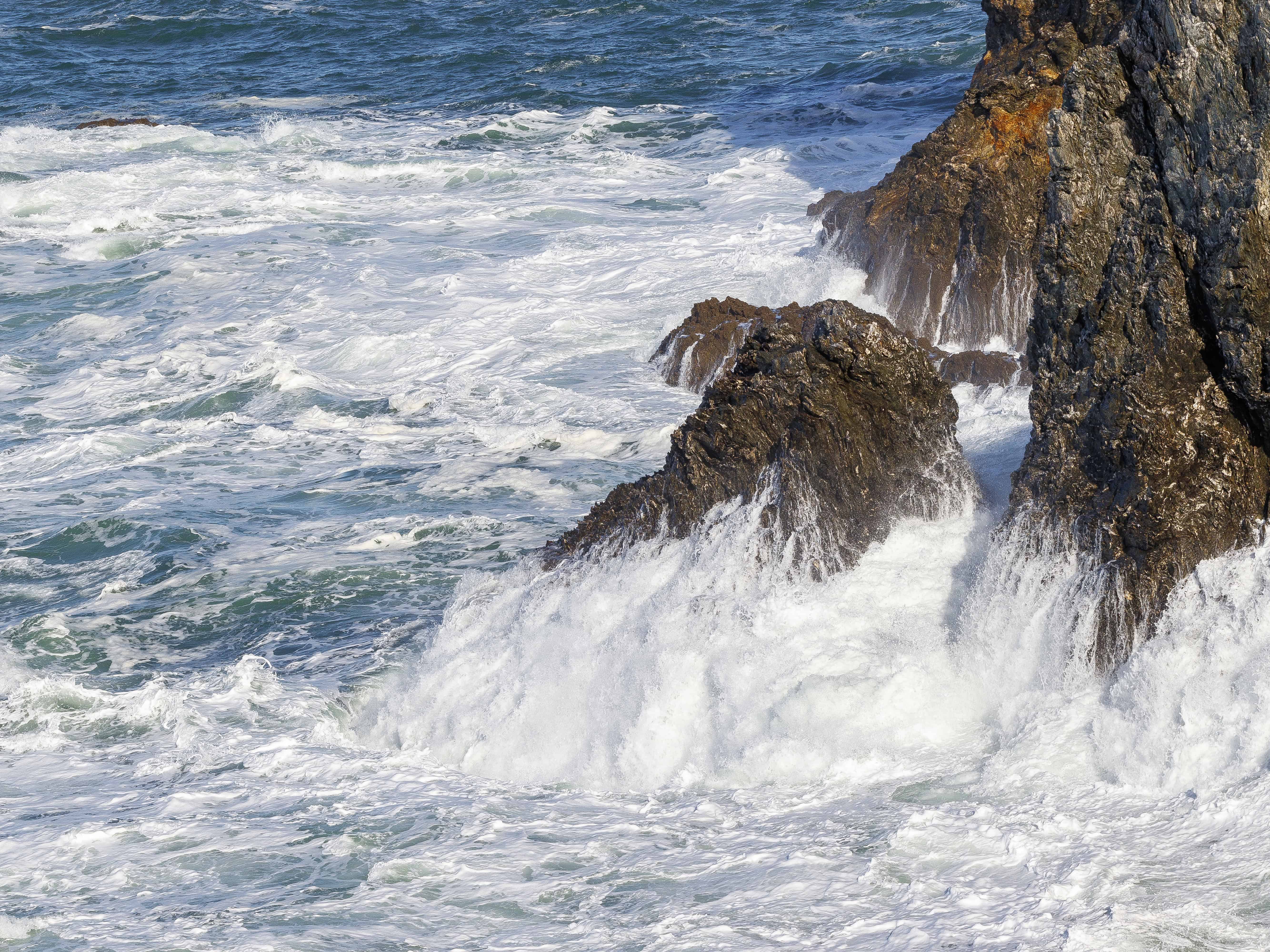
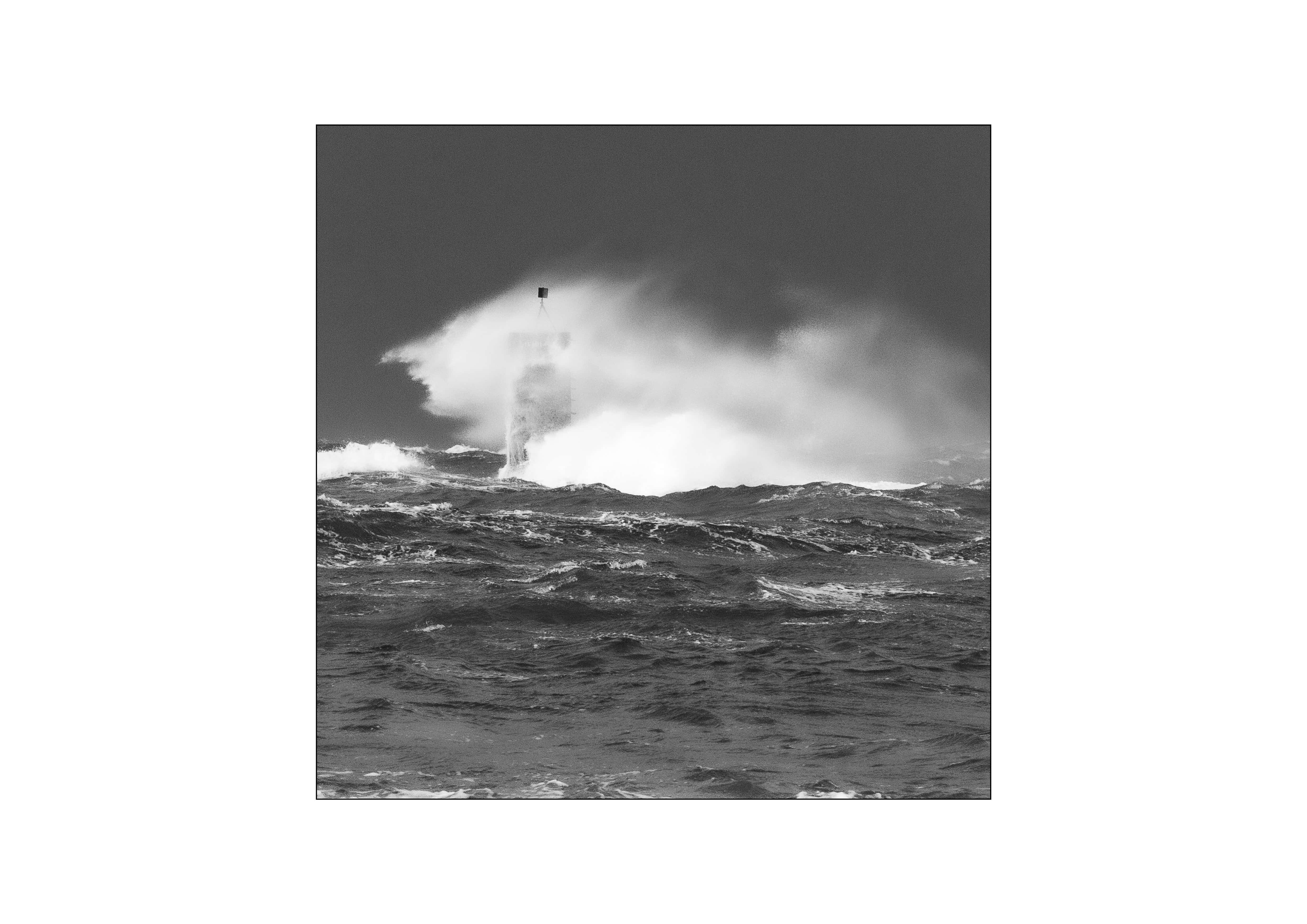
  • How to Photograph Coastal Landscapes in October

    How to Photograph Coastal Landscapes in October

    Atlantic Coast · Field Notes

    How to Photograph Coastal Landscapes in October

    The month the sea starts speaking again — low light, high water, and no one left on the headland but you.

    October is when the Atlantic remembers what it is. The flat, generous light of summer thins out. The first true swells arrive from somewhere far to the west, and the coast empties of everyone who came for the beach. What’s left is the version of the shore I’ve spent forty years photographing: raw, unhurried, and honest. If you only shoot the sea for one month of the year, make it this one.

    This is a field guide, not a lecture. I’ll walk through the light, the water, the settings, and the specific Finistère locations that come alive in autumn — with the technical detail set aside in its own boxes so the story doesn’t stop for it. Take what’s useful and leave the rest on the rocks.

    The Light

    Why October for coastal landscape photography?

    The sun sits lower now, and it stays low. Through summer the good light is a narrow window at each end of a very long day; in October the whole day tilts golden and grey. The sun rises late enough that you don’t have to abandon sleep entirely to catch dawn, and sets early enough that blue hour arrives while you can still feel your hands. That lower angle rakes across wet granite and pulls texture out of everything — the grain of the rock, the drag of the foam, the ribs of sand the last tide left behind.

    It’s also weather that moves. A single October morning can hand you fog, a break of hard sun, a squall, and then that scoured post-storm clarity where the air looks rinsed. Don’t wait for perfect conditions. The imperfect ones are the photograph. My whole Fury and the Grace series lives in exactly this instability — the moment the weather can’t decide.

    Field Kit — reading the sky

    Shoot the transition, not the peak

    The strongest coastal frames come in the ten minutes on either side of a change: as fog lifts, as a squall clears, as the sun drops behind a bank of cloud and everything goes to pewter. Watch the horizon upwind — that’s where your next set of conditions is coming from — and be set up before it arrives, not scrambling when it does.

    Overcast is not a wasted day. A flat white sky is a giant softbox and the perfect ground for high-key, minimalist water studies — the register my Atlantic Silences work lives in.

    The Water

    Working with autumn swell and tides

    October brings bigger tides and bigger water, and both are your material. A rising equinoctial tide against a rocky point is pure drama; a long ebb leaves you reflective flats and isolated pools that mirror the sky. The trick is to know which one you’re walking into before you commit to a spot, because on this coast the difference between a shooting position and a swim is about ninety minutes.

    The sea in October doesn’t pose. You wait, and it gives you something.

    Long exposure is the technique that turns all this movement into feeling. Smoothing a heaving sea into mist strips the literal chaos out and leaves the mood behind — the ephemeral, the quiet after the violence. It’s the single most transformative thing you can do with autumn water, and October’s low light makes it far easier to pull off than the glare of July.

    Field Kit — the long-exposure recipe

    Turning swell into silk

    Start from a tripod — non-negotiable — and a remote release or 2-second timer. Meter for the scene, then add your neutral-density filter and let the exposure stretch. Aim for a shutter long enough to blur the water but short enough to keep some structure in it; fully-milk-smooth is a choice, not a default.

    Filter
    6-stop ND for moving cloud & texture; 10-stop for glassy, minimalist water
    Shutter
    1–4 s for energy in the wave; 15–60 s for full silk
    Aperture
    f/11 for edge-to-edge sharpness without diffraction softening
    ISO
    100 — keep it at base and let time do the work

    Wipe the front element between frames — October spray is relentless — and check the corners for creep on very long exposures.

    The Settings

    A starting point for the shore

    There’s no single correct exposure on the coast — only the one you decide to author. But if you’re arriving cold on an October morning and want a base to work from, start here and adjust to the light in front of you.

    Mode
    M / Av
    Manual, or aperture priority + exposure comp
    Aperture
    f/11
    Deep focus, peak sharpness
    ISO
    100
    Base ISO, cleanest files
    Focus
    Manual
    On the rock, ~⅓ into the frame
    White balance
    Daylight
    Fixed, so frames match in edit
    File
    RAW
    Always — October skies need the latitude

    Expose to protect the highlights in the sky and the foam; you can always lift the granite in post, but blown white water can’t be recovered. If you work in black and white — and on this coast, in this month, I almost always do — think in tones as you shoot, not in colour. Ask where your brightest bright and deepest dark will sit before you press the shutter.

    The Places

    Four Finistère spots that come alive in October

    These are places I return to when the season turns. None of them need a crowd, and all of them are better in bad weather.

    1

    Phare du Four

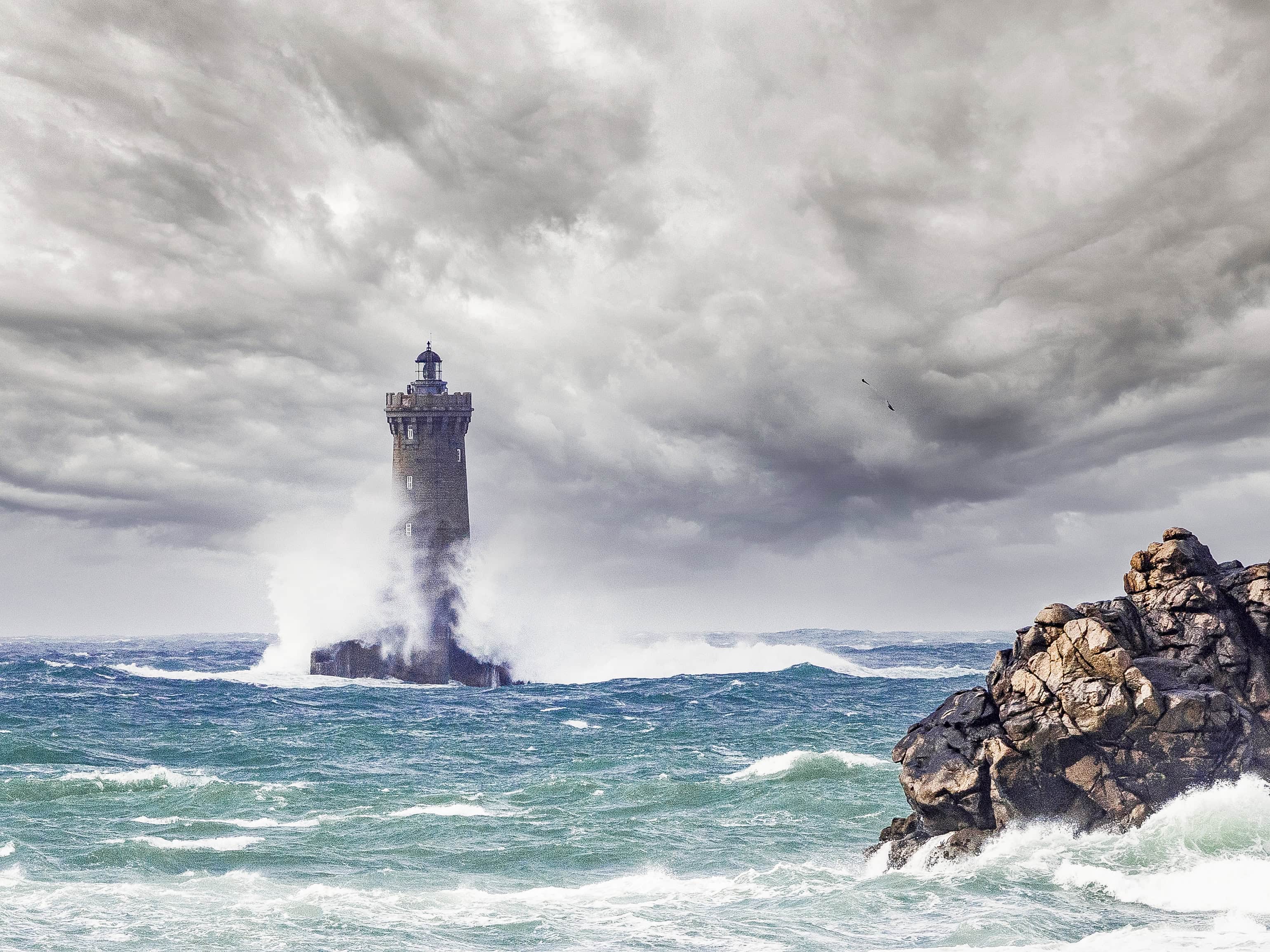
    The lighthouse offshore from Porspoder is at its most cinematic when an October swell wraps around its base. Shoot it from the shore at rising tide with a long lens compressed against a moody sky — the isolation is the whole image.

    2

    Pointe de Pen-Hir

    The Tas de Pois stacks marching out to sea are made for autumn light and long exposure. Late afternoon, west-facing, with the sun sinking behind the swell — this is a full-drama location.

    3

    Baie des Trépassés

    A wide, exposed beach that takes the full force of the Atlantic. On a big ebb it gives you reflective sand and a clean horizon; on a rising storm tide it gives you fury. Come for either.

    4

    Cap de la Chèvre

    Heather-topped cliffs and layered headlands that fade into October haze — the natural home for minimalist, high-key work. Best in the soft grey light after a front passes through.

    October coastal checklist

    • Check the tide table and shoot the ninety minutes around the turn
    • Sturdy tripod, ND filters (6- and 10-stop), remote release
    • Lens cloths — more than you think you need — and a rocket blower
    • Waterproof shell, grippy boots, gloves you can shoot in
    • Spare batteries kept warm; cold October air drains them fast
    • Tell someone where you’re going, and know your tide escape route
    • Arrive early enough to be set up before the light turns

    Safety isn’t a footnote on this coast in autumn. Rogue sets come further up than you expect, granite is lethal when it’s wet, and the light that makes the picture is also the light that makes it hard to see the water coming. Keep one eye on the sea at all times. No frame is worth a slip.

    A photograph is not taken. It is received.

    Photograph the October coast with me

    Every autumn I run a small storm-season workshop in Finistère — four photographers, the wildest light of the year, and the water at its most alive. If this is the coast you want to learn to read, come and read it with me.

    See the workshops
  • Is using Lightroom cheating ?

    Is using Lightroom cheating ?

    Craft & Process

    Is Using Lightroom Cheating?

    Forty years behind a camera, and I still open every single RAW file in Lightroom before it leaves my hard drive. Here’s where I actually draw the line — and a real edit that shows it.

    I get this question at almost every workshop… Is using Lightroom cheating?

    It’s not a new argument. Photographers were having this fight in the darkroom decades before Lightroom existed — dodging and burning, pushing film, choosing which grade of paper would hold the shadows. The tool changed. The question didn’t.

    So let me actually answer it, instead of dodging it the way the internet usually does.

    Where I think the line sits — not a binary, a spectrum
    CaptureWhat the sensor recorded
    CraftExposure, tone, contrast — recovering what your eye saw
    The lineRemoving or adding what was never there
    MisrepresentationComposite skies, invented detail, staged reality

    Everything to the left of that mark is what I’d call craft. Everything to the right is a different kind of image-making entirely — not wrong, necessarily, but not what I’m doing, and not what most landscape photographers mean when they say “straight photography.”

    Post-processing isn’t the opposite of an honest photograph. Editing badly is.

    RAW files are deliberately flat and desaturated — that’s not a flaw, it’s the sensor handing you the full range of information it captured and trusting you to make the decisions your eye already made in the field. A camera’s in-body JPEG engine is also “editing” your photo; it’s just editing it for you, with someone else’s taste. Shooting RAW and processing it yourself isn’t a shortcut around skill. It’s where a huge part of the skill actually lives.

    So — is using Lightroom cheating?

    I want to be precise here, because “it’s all just a spectrum” can become an excuse for anything. There are things I won’t do, on any file, for any client:

    The three rules I won’t break

    • No compositing elements that weren’t there. A sky from a different day, a moon dropped in from stock — that’s a different medium wearing a photograph’s clothes.
    • No fabricated detail from generative AI fill. If a tool is inventing texture that no sensor recorded, I’m not looking at my photograph anymore.
    • No claiming a moment that didn’t happen. If I wait four hours for a storm to break over Finistère, the edit can make that light sing — it can’t manufacture the wait.

    Within those limits, I use every tool Lightroom gives me, without hesitation. Cropping, exposure, white balance, tonal contrast, selective dodging and burning — this is the same vocabulary Ansel Adams used in a darkroom with an enlarger and his hands. Nobody accuses him of cheating. They call the Zone System a masterclass.

    A real edit, step by step

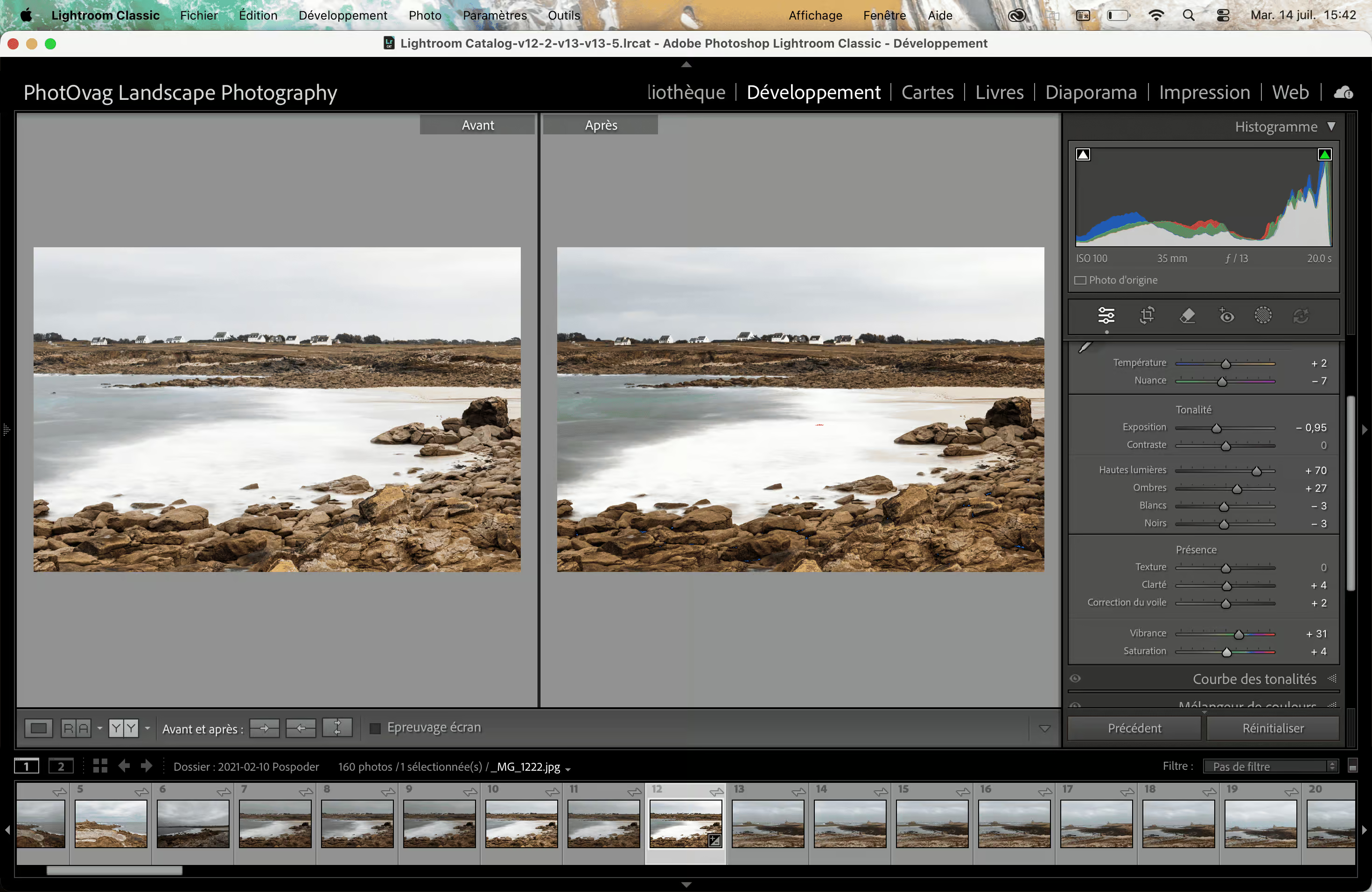
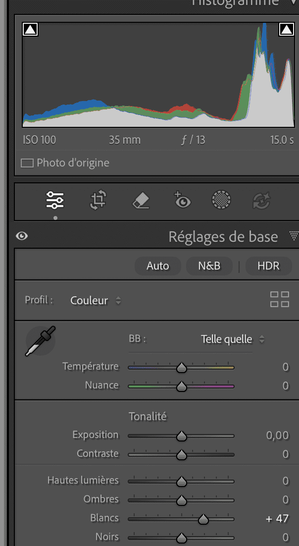
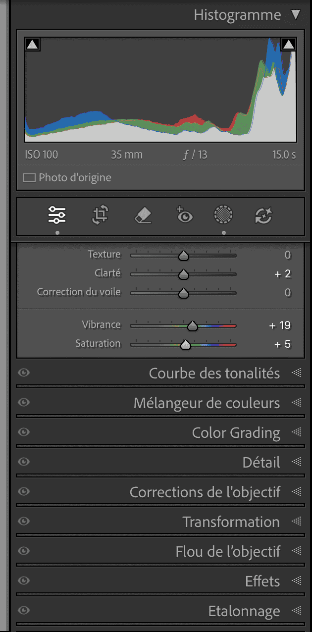
    Talk is easy. Here’s an actual file from The Fury and the Grace — a storm rolling in off the Finistère coast — taken through the full Basic panel workflow I use on almost every image.

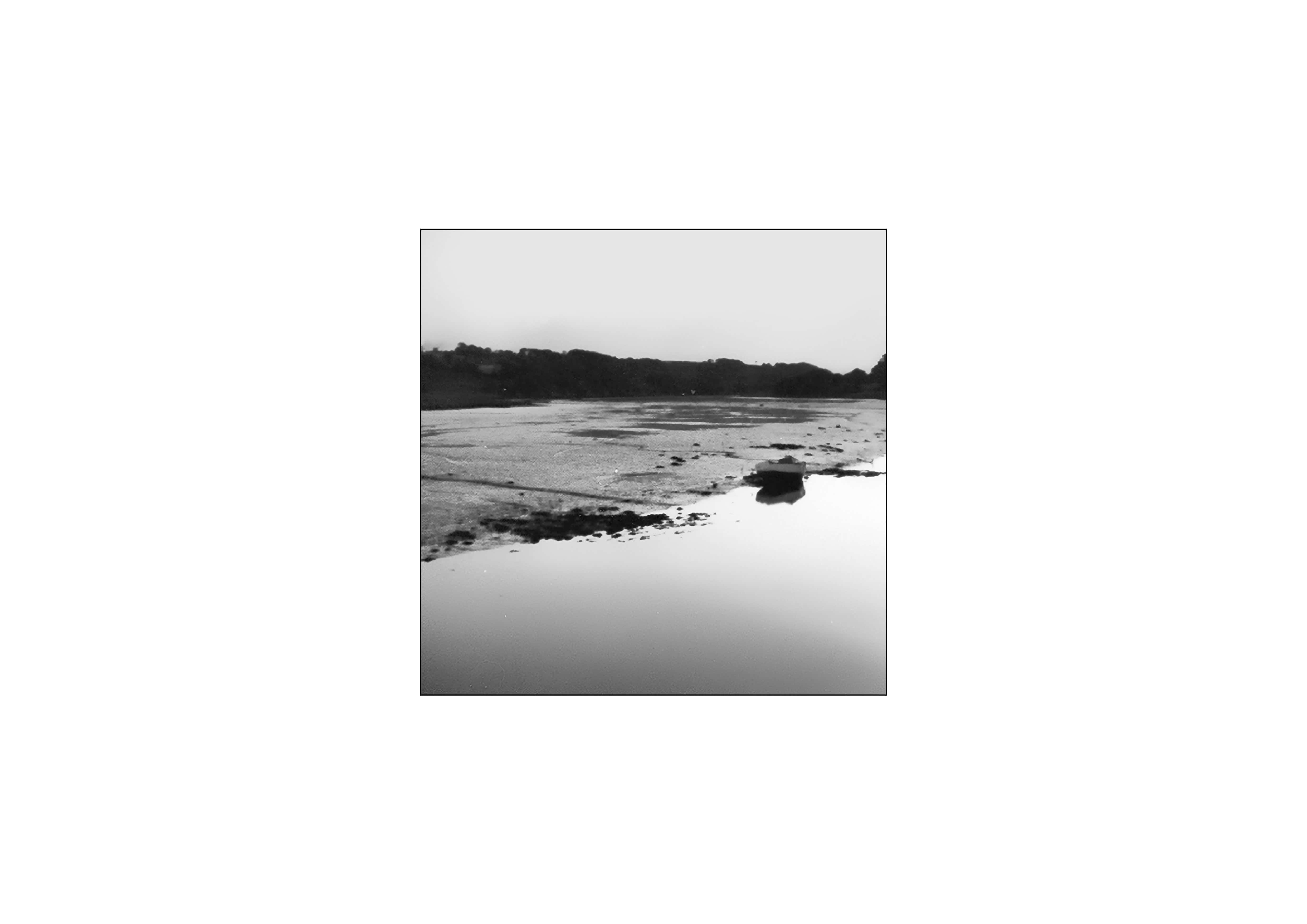
    Before & After the Basic panel Landscape photography of a rocky shoreline with water and distant land.
    Same file. Same sky. Nothing added, nothing removed.

    I go through these in editing order, not the order the sliders appear in the panel — that matters more than people think, because each step changes what the next one needs to correct.

    01

    Crop

    A distracting patch of foreground vegetation sat bottom-right of the frame. Rather than clone it out, I cropped it away — a small loss of sand, no real change to the composition’s balance.

    02

    White balance

    Storm light skews cool. I warmed it slightly — +300K — back toward what the scene actually felt like standing there, not toward what the sensor’s auto-WB guessed.

    03

    Exposure

    Exposed to the right in-camera to protect the highlights in that sky, which left the sand dark and flat. A global exposure lift of +0.6 EV brought the midtones back to where my eye placed them.

    04

    Contrast & tone curve

    A gentle S-curve to reintroduce depth the flat RAW profile strips out — deepened blacks, held the whites just short of clipping.

    05

    Highlights & shadows (local)

    A radial mask over the sky pulled highlights down -40, recovering the texture in the storm clouds that was already there in the data — not inventing it, uncovering it.

    06

    Clarity & texture

    A modest +15 clarity on the sand and rock to hold the sense of grit and weather without tipping into the over-sharpened, HDR-looking edit I actively avoid.

    07

    Vibrance & saturation

    A light +8 vibrance, saturation left almost untouched. My series works in square-format black and white more often than not — even in color, I’d rather an image read as quiet than loud.

    Want the deeper version of this workflow, with screenshots of every slider and why I reach for each one in this order? I’ve written the full breakdown: Expose to the Right: What Film Never Let Me Get Away With covers the capture-side discipline that makes all seven of these steps easier.

    So — is it cheating?

    No. Not this. Not the seven steps above, not the decades of photographers before me who did the same work with an enlarger instead of a slider. What you saw at that cliff edge at 6am wasn’t a shortcut around the photograph — it was half of it. The other half happens afterward, at a desk, with the same discipline and the same eye.

    The photograph that lied to you isn’t the one that was processed. It’s the one that pretended it wasn’t.

    Want an honest eye on your own edits?

    I offer 1:1 coastal photography coaching — from field technique through to a Lightroom workflow that respects the moment you actually stood in.

    Explore Coaching
    Is editing in Lightroom considered manipulation?

    Tonal and exposure adjustments — the kind covered in the Basic panel — are standard practice and not considered manipulation by most photography competitions or publications. Manipulation typically refers to adding, removing, or compositing elements that weren’t in the original capture.

    Do professional landscape photographers edit their photos?

    Yes, virtually all of them. Shooting RAW specifically requires post-processing, since RAW files are intentionally unprocessed by the camera and need tonal correction to look as intended.

    What’s the difference between editing and photo manipulation?

    Editing adjusts values already present in the capture — exposure, contrast, color, cropping. Manipulation adds or removes content that wasn’t there: composited skies, cloned-out elements, AI-generated detail.

  • Understanding Exposure

    Understanding Exposure

    Mastering the Craft

    Understanding Exposure

    Before it is a setting, exposure is a decision — how much light you let the world leave on the sensor.

    Have you ever taken a photo that turned out way too dark, or so bright that all the details disappeared? Understanding exposure in photography is the single most important step to turning disappointing snapshots into stunning, professional-looking images.

    At its core, exposure is simply the amount of light that reaches your camera sensor when you take a picture. Get it right, and your photos will be crisp, clear, and perfectly balanced. Get it wrong, and you run the risk of under or overexposed photos. In this comprehensive guide, we will break down understanding exposure into simple, actionable concepts. You will learn how the three pillars of photography—aperture, shutter speed, and ISO—work together to give you full creative control over every shot you take.

    One — The Idea

    What exposure really means

    Strip away the menus and the acronyms, and exposure is a simple thing: the amount of light that reaches your sensor while the shutter is open. Too little, and the image sinks into shadow. Too much, and it dissolves into white. Everything else — every dial, every reading — exists only to govern that one flow of light.

    Think of the sensor as a vessel left out in the rain. Exposure is how long you leave it out, how wide you open its mouth, and how sensitive it is to each drop. Fill it well and the frame holds detail from the darkest granite to the brightest foam. This is the whole game, and once you feel it that way, the settings stop being obstacles.

    Two — The Mechanism

    The exposure triangle

    Three controls decide how much light lands and what that light looks like. Most guides describe what they do to the meter. It is more useful to learn them by what they do to the picture — because each one is also a creative choice.

    Exposure triangle diagram — aperture, shutter speed and ISO — Photovag
    The exposure triangle — Photovag
    Aperture

    Depth

    How wide the lens opens. A wide aperture floods the sensor and throws the background into softness; a narrow one starves it of light but holds the whole scene sharp — from the foreground rock to the far headland.

    Shutter

    Movement

    How long the sensor stays open to the light. Fast, and the breaking wave freezes mid-shatter. Slow, and the same wave becomes mist drawn across the rock — the difference between the fury and the grace, held in a single dial.

    ISO

    The trade

    How strongly the signal is amplified. Raise it and you buy light in low conditions; the cost is texture — a fine grain rising through the shadows. Not always an enemy, but always a choice you make on purpose.

    Change one, and the light budget shifts. Open the aperture and you can shorten the shutter; lower the ISO and you may need to slow it down. They are not three separate settings but one conversation, and learning exposure is learning to hear all three at once.

    Three — The Point of View

    There is no correct exposure

    The camera will tell you that the scene is properly exposed. It is measuring toward a neutral grey — a mathematical average, not an intention. On the coast, where a white sky meets black wet stone, that average is almost always wrong for what you feel.

    The histogram is a tool, not a judge. It shows you where the light fell — never where it belongs.

    Expose for the emotion, not the meter. A high-key frame — bright, quiet, drained of contrast — is how the Atlantic Silences breathe; you push the exposure up and let the histogram lean right on purpose. A study of granite lives at the other end: deep, weighted, the shadows kept dark because that is where the gravity is. Neither is a mistake. Both are decisions.

    So read the histogram to protect your detail — to make sure the highlights are not truly clipped and the shadows still hold information — and then place your exposure where the picture wants to live. The right exposure is the one that serves the image you came to make.

    Three & a Half — The Inheritance

    Adams, the Zone System, and the darkroom in your hands

    Long before histograms glowed on the back of a camera, Ansel Adams and Fred Archer built a way of thinking that still governs how a thoughtful photographer exposes. They called it the Zone System, and its premise is quietly radical: you do not photograph what the meter sees — you decide, before the shutter opens, where each tone in the scene should fall.

    Adams divided the tonal range into eleven zones, from pure black to pure white, marked with Roman numerals. Zone 0 is total black with no detail; Zone V is middle grey — exactly what your camera’s meter assumes everything to be; Zone X is paper-white, blown clean. The zones between are the ones that matter: Zone III, where shadow detail first appears, and Zone VII, where highlight texture still holds.

    0
    I
    II
    III
    IV
    V
    VI
    VII
    VIII
    IX
    X
    Pure black Middle grey — Zone V Paper white

    The practical genius of this is placement. Point your spot meter at a wet granite face and the camera wants to render it Zone V — a flat middle grey. But you know that stone is dark. So you place it deliberately on Zone III, closing down about two stops from what the meter suggests, and the rock keeps its weight and menace. Meter the foam of a breaking wave and the camera again pulls it to grey; you place it on Zone VII or VIII instead, and the sea keeps its brightness without going blank. This is exposing for intention rather than obedience — the very heart of the previous section, given a precise language.

    You place a tone. The rest of the scene falls where it will — and that is where the print begins.

    Reading it on the histogram

    The modern histogram is the Zone System made visible. Its horizontal axis is the zone scale — pure black at the far left, paper-white at the far right, middle grey in the centre. Where the peaks pile up tells you which zones your scene occupies. Three deliberate placements, three very different graphs:

    Low key
    Granite. Tones gathered left, around Zones II–IV. Dark by design — check nothing clips hard against the wall.
    High key
    Atlantic Silences. Tones pushed right, Zones VI–IX, leaning toward the edge — bright, quiet, but held short of pure clipping.
    Full range
    A stormy sky over lit sea. Tones spread from Zone II to Zone IX — the widest contrast the frame can hold without loss at either end.

    Dodge and burn — finishing what exposure began

    Adams rarely considered a negative finished at exposure. In the darkroom he would hold light back from some areas of the print and add it to others — dodging to lighten, burning to darken — coaxing each region toward the zone he had imagined on the tripod. His famous prints were not captured whole; they were built, sometimes over hours, one region at a time.

    Lightroom and Camera Raw put that same darkroom in a set of local tools. The adjustment brush, the radial and linear gradients, and the masking panel let you lift a foreground rock out of shadow while leaving the sky untouched, or pull a hot patch of cloud back down before it burns to white. The principle is unchanged since Adams: expose to protect the full range of information, then guide the eye by lightening and darkening locally — dodging the point of focus into prominence, burning the edges of the frame so the gaze stays where you want it.

    This is why exposing to protect detail matters so much on the coast. A histogram nudged right, shadows kept just off the left wall, highlights held just short of Zone X — that is the negative Adams would have wanted: rich in information, waiting for your hands. The exposure is where the photograph is received. The dodging and burning is where it is authored.

    On the Coast — In Practice

    Metering a Finistère sky

    A bright overcast sky will fool the meter into darkening everything beneath it. Meter off the mid-toned rock or the water instead of the sky, then use exposure compensation to lift the frame back to where you want it — often +0.7 to +1.3 stops when the sky dominates.

    For the moving sea, decide the story first: a fast shutter to hold a wave’s collapse, or several seconds on a tripod to smooth the water to silk. On Skye’s long, low light, expose to keep the highlights just short of clipping and recover the shadows later — the approach explored in the ETTR article.

    Exposure is the first decision an author makes. Everything the photograph becomes begins with how much light you chose to receive.

    The photograph is not taken. It is received.
  • How to Process Your Negatives

    How to Process Your Negatives

    Photovag · The Darkroom

    How to Process
    Your Negatives

    From the developing tank to the Lightroom file: five stages, and at each one the same honest question — do it yourself, or have it done.

    Film Black & white 35mm & square

    People often ask whether I’m “going back” to film. The truth is simpler: I never really left it, and above all I don’t set it against digital. A black-and-white negative is matter — grain, a curve, a density — and to process it is to decide which part of that matter you want to survive all the way to the print.

    This article follows the whole chain, from exposed film to a file ready to print. At every stage I weigh the same balance: do it yourself or have it done. There’s no universal right answer — only yours, dictated by your time, your volume, and how much control you want to keep over the result.

    Chapter I

    Developing the film

    This is the irreversible stage. Once the film hits the fixer, the negative is what it is: the tonal curve, the contrast, the rendering of the grain are already largely decided. Everything that follows — scanning, Lightroom — only interprets what developing has written in.

    Do it yourself
    • Total control over the developer / dilution / time combination — and therefore over contrast and grain.
    • Very low marginal cost once the gear is paid off (tank, thermometer, chemistry).
    • You can push or pull a film to match the light on the day of the shoot.
    • Consistency is a skill you build: agitation, 20°C temperature, rinsing.
    • Upfront investment and a dedicated space (darkness to load the tank).
    • Spent chemicals to dispose of responsibly.
    Have it done
    • No chemistry, no gear, consistent results from a serious lab.
    • Ideal for low volume or for starting out without spreading yourself thin.
    • A good B&W lab will honour a requested push (e.g. Tri-X at 800).
    • Postal turnaround and a per-roll cost that climbs fast with volume.
    • You’re delegating the single most decisive parameter in the whole chain.
    • Few labs handle craft B&W with care; many run a standard machine process.
    What I lived through

    Back then, I developed my own colour slides — I shot a lot of them, I had a lab, it made sense. But the time it swallowed was real, and mounting each series onto slide holders stayed a fiddly, delicate chore.

    Today, I don’t shoot enough film for a home lab to make sense again. The maths flipped: what volume once made worthwhile has become a luxury of time I’d rather invest out in the field.

    Olivier — Photovag
    Where I stand Develop your own black and white. It’s the stage where you gain the most visual signature for the least money. A heavily diluted Rodinal, a stand development, and the grain becomes handwriting rather than a flaw. Send it to a lab if you shoot three rolls a year — take it back the moment film becomes a practice. Volume decides: my own lab only survived as long as I kept feeding it.
    Chapter II

    Digitising

    The negative exists; now it has to make its way into the computer. This is where the fineness is decided — the true resolution, the rendering of micro-contrast, and above all the fidelity of the grain. Three personal routes open up before we even talk about outsourcing.

    The three “in-house” methods

    Flatbed scanner
    • An Epson V600 / V800 with film holders handles 35mm as well as square 6×6.
    • Simple workflow, several frames at once, dust kept in check.
    • Excellent for square medium format: the surface area does the work.
    • Modest real sharpness in 35mm: fine grain sometimes gets “smoothed”.
    • Slow if you’re digitising a lot.
    Camera scanning (DSLR/mirrorless)
    • A camera photographing the negative on a light table: your Canon or the Q2 make a formidable scanner.
    • Far superior sharpness and dynamic range in 35mm; grain rendered faithfully.
    • Fast once the rig is dialled in (copy stand, macro lens, neutral light source).
    • Square format needs a lens that covers the frame well plus a truly flat negative.
    • Demands film flatness, rigorous alignment and a good macro lens.

    The dedicated film scanner (a Plustek for 35mm, say) is a third route: excellent frame-by-frame sharpness, but slow and limited to 35mm — a poor fit if you also work in square format.

    What I lived through

    I owned a Plustek, precisely for that frame-by-frame sharpness. I sold it. Too slow to work through, first of all — each frame ties up both the machine and your attention. And above all, the repeated handling of the negative in the film holder: over time, the risk of a scratch becomes a constant anxiety.

    Camera scanning solved both problems at once: I lay the strip down once on the light table, I photograph it, the negative is handled as little as possible. Faster, and gentler on the matter.

    Olivier — Photovag
    Do it yourself
    • Control over resolution, exact cropping and the rendering of grain.
    • Camera scanning = near-pro-scan quality for a gear cost you already partly own.
    • Digitise on demand, no waiting.
    • A learning curve on the copy rig and on dust management.
    Have it done (lab / pro scan)
    • High-end scanners (Noritsu, Frontier, or a drum scanner at the very top end).
    • Sharpness and cleanliness that are hard to match at home, especially in 35mm.
    • Worth it for an image destined for a large Fine Art print.
    • High per-frame cost, less sustainable at volume.
    • The lab often chooses the look for you (contrast, sharpening).
    Where I stand Flatbed for square, camera scanning for 35mm. Medium format forgives the flatbed; small format needs the sharpness of the camera. I reserve a lab’s drum scan for the few images destined for a large print on the Epson SC-P700.
    Chapter III

    Processing in Lightroom

    The file is here: a negative, often inverted, sometimes veiled by the film’s mask. Two distinct tasks await us — invert to get a positive, then interpret without betraying. And it’s on this second point that I want to dwell, because it’s where we go wrong most often.

    Turning a negative into a positive

    For black and white, inversion is straightforward: flip the tonal curve (black point to top right, white point to bottom left) in the Tone Curve panel, then adjust the black and white points. A plug-in like Negative Lab Pro automates the operation and handles the film base; but on pure B&W, the manual curve is enough and keeps you master of the contrast.

    The Photovag stance

    You don’t develop a negative in order to cleanse it of what makes it a negative. Grain is not noise. A period exposure is not an error to fix. Correcting film until it’s smooth means manufacturing a fake digital file — and losing the one thing you came looking for.

    Don’t “correct” the film

    The temptation is everywhere in Lightroom: noise reduction that melts the grain, Clarity and Texture pushed until the matter hardens, shadow recovery that flattens a deliberately dense exposure. Resist. In concrete terms:

    — Noise reduction to zero on luminance grain. Film grain is the texture of the image, not an artefact.
    — Respect the original exposure. If the scene was contrasty or dense, keep it that way; don’t open the shadows by reflex.
    — Clarity and Texture sparingly. They reinvent a micro-contrast the film has already drawn in its own way.
    — Measured sharpening. Over-sharpening turns grain into gravel.

    The useful work does remain: black point and white point, the overall balance of the curve, a few local adjustments with the brush. The rest belongs to the film.

    Do it yourself
    • You decide exactly what survives of the negative — this is the heart of the signature.
    • Total consistency with the rest of your printing workflow.
    • Inversion + curve: a few minutes once the gesture is learned.
    • It takes restraint: the tool always nudges you to “improve”.
    Have it done (outsourced retouching)
    • A lab often delivers positives already “clean”, ready to use.
    • A real time saving at volume.
    • Standardised look: grain smoothed, contrast normalised, your voice erased.
    • You get back an interpretation, not raw matter to work with.
    Where I stand Always do it yourself. It’s the least expensive stage and the most decisive for the image’s identity. To delegate film retouching is to delegate your eye.
    “Grain is not a flaw to remove.
    It’s the handwriting of the negative.”
    Chapter IV

    Storing the strips

    A well-kept negative can be re-scanned ten years later; a badly stored one gets scratched, fogged or lost. It’s the life insurance of your film work, and it costs next to nothing.

    The method

    After drying away from dust, cut the film into strips — 6 frames for 35mm, 3 frames for square 6×6 — and slide them into acid-free archival sleeves (glassine or archival-grade polypropylene, never PVC, which off-gasses). Each sheet goes into a binder, away from light, in a dry, temperate place. Number it, date it, note the location — your future self will thank you.

    Do it yourself
    • Trivial cost: a few cents per archival sheet.
    • Immediate access to your negatives to re-scan or print later.
    • You own the filing (by series, by location, by date).
    • Discipline required: index as you go, not “later”.
    Have it done
    • Some labs return the film already sleeved and with a contact sheet.
    • Useful as a starting point.
    • Nothing replaces your own indexing; no one knows your series.
    Where I stand Do it yourself, without hesitation. It’s not a question of skill but of habit. An archival sheet, a numbering system, a notebook — and a negative from the Memory of Granite series shot today will still be printable in twenty years.
    Chapter V

    Choosing the film

    We stay true to the line: black and white, in 35mm and square 6×6. Choosing a film is choosing a grain, a curve and a latitude — decisions all made before you even press the shutter. Here are the safe bets, read through the three keywords: ephemeral, wild, emotion.

    FilmSpeedCharacter & coastal use
    Kodak Tri-X 400 400 ISO The classic. Marked, meaty grain, enormous latitude, pushes beautifully to 800/1600 for storm skies. The film of The Fury and the Grace.
    Ilford HP5 Plus 400 ISO Supple, forgiving, superb when pushed. A touch softer than Tri-X. Excellent coastal all-rounder, from high wind to low light.
    Ilford FP4 Plus 125 ISO Fine grain, rich tonality. For calm seas and the long exposures of Atlantic Silences, on a tripod.
    Ilford Delta 100 100 ISO Very fine grain (T-grain), high sharpness. The choice for detail — granite, Celtic crosses, the mineral textures of Memory of Granite.
    Kodak T-Max 400 400 ISO Fine grain for its speed, a modern, crisp rendering. When you want the flexibility of 400 with more finesse than Tri-X.

    In practice: a “fast” emulsion (Tri-X or HP5) for the living coast and the storms, a “slow and fine” emulsion (FP4, Delta 100) for long exposures and the mineral. Two bodies, two loaded films, and most of the Finistère coast is covered.

    Where I stand Tri-X 400 as the war film for the storm and the ephemeral, FP4 / Delta 100 for the silence and the matter. Two families, one coherent handwriting — that’s enough, and the rest is just dispersion.

    To process is to choose

    At every stage, the real question isn’t “can I delegate this?” but “what do I lose if I delegate it?”. Developing and Lightroom processing: keep them. Digitising and developing: outsource if volume demands it. The rest belongs to you.

    The negative is never more than a starting point. What you make of it — that is photography.

    Olivier — Photovag
    Ephemeral · Wild · Emotion
  • The Tone Curve & Black and White

    Mastering Lightroom · Part 2

    The Tone Curve & Black and White

    Sculpting light, separating grey from grey

    After the Basic panel, two tools truly decide the soul of a black and white image: the tone curve and the B&W mixer. One shapes light tone by tone; the other translates each original colour into a shade of grey. This — not the basic sliders — is where the difference lies between a desaturated snapshot and a print that breathes.

    In the Fury and the Grace series, almost everything looks alike in colour: a grey-blue sky above grey granite. Simply pull the saturation out and rock and sky merge into the same mush. The curve and the mixer exist for exactly this moment — restoring separation where the camera saw none.


    1 The curve over the sliders

    A scalpel where the Contrast slider is a mallet

    The Contrast slider in the Basic panel applies a fixed, global adjustment: it doesn’t tell your highlights from your shadows — it pushes everything in the same rigid motion. The curve does the opposite. It lets you remap any brightness value in the image, independently of the others. It’s the difference between shoving a single slider and redrawing how the whole range of tones is distributed.

    In practice: where Contrast brightens your whites and darkens your blacks in one inflexible gesture, the curve lets you touch only the deep shadows while leaving the midtones untouched. For a mineral image where the detail lives in the mid-tones, that precision changes everything.

    Where to find it

    The Tone Curve panel sits in the Develop module, just below the Basic panel and above the HSL panel. In the cloud version (Lightroom CC), the curve lives in the Light section: open the Light panel, then expand the Curve option.

    2 Read the curve before you touch it

    The histogram, sitting behind the line

    The curve is a diagonal: from the lower-left corner (the darkest tones) to the upper-right (the brightest). The horizontal axis is the original brightness of your pixels (the input); the vertical axis is the new value you assign them (the output). Raise a point and it brightens; lower it and it darkens.

    Behind that line, Lightroom displays the image’s histogram. It’s your map: it tells you where your tones actually live before you move them. On a Fury and the Grace print, you’ll often see a mass bunched in the midtones — that’s the mass you’ll need to stretch to bring matter back into the stone.

    The curve overlaid on the histogram: read first, act second.

    3 Parametric or point

    Two ways to draw, two temperaments

    Lightroom offers two approaches to the same curve. The parametric curve works with four sliders — Highlights, Lights, Darks, Shadows — each governing a band of tones. It’s ideal for smooth transitions: it keeps the curve from turning jagged and protects you from accidental reversals. It’s the recommended starting point.

    The point curve lets you place your own control points for bespoke shapes. It’s the tool of surgical precision, for when you want to target a narrow tonal range. A common workflow is to start parametric for a predictable result, then switch to point to chisel.

    Lightroom Classic

    Parametric and point are two ways of shaping one and the same curve. You switch between them via the small icon at the top (or bottom-right) of the panel. The triangles beneath the curve reposition the tonal ranges.

    Lightroom CC (cloud)

    The parametric and point modes have independent curves. You reach them via Light → Curve, then choose the point entry or the range sliders.

    The targeted adjustment tool

    The small circle at the top left of the panel (the targeted adjustment tool) is your best ally: select it, then click and drag directly on the image, up or down, over the area you want to adjust. Lightroom moves the curve for you, keeping your eye on the photo rather than on the graph.

    4 The S-curve, Atlantic edition

    Adding matter without crushing the blacks

    The founding gesture: the S-curve. On the point curve, add a point in the highlights and lift it slightly, then add a point in the shadows and pull it down. You increase local contrast while keeping a natural response through the midtones.

    For an Atlantic-coast look — heavy sky, sea foam, wet rock — I keep the S gentle. Too strong an S clogs the blacks and burns out the foam; all the matter of a Fury and the Grace image lives precisely in those transitions. Work in small moves and watch both ends of the histogram: the moment a cliff appears against the edges, you’ve gone too far.


    5 Going black and white — for real

    Why the mixer, never desaturation

    You can “desaturate” an image by dragging Saturation to zero. That’s a mistake. A great black and white is not a colour photo with the colour stripped out: it’s a work on the relationships between the original colours, converted to grey according to your choices.

    The true entry point: at the top of the Basic panel, set Treatment to Black & White — or simply press V. Lightroom then swaps the Color Mixer panel for a dedicated B&W panel, where eight colour ranges become your conversion levers.

    Profile tip

    Before you even touch the sliders, try the Adobe Monochrome profile (or one of the profiles in the B&W group) in the Basic panel. It gives a richer starting point than a raw conversion — one the mixer will then refine.

    6 The B&W mixer on stone

    Separating grey granite from grey sky

    The B&W panel shows eight colour sliders: red, orange, yellow, green, aqua, blue, purple, magenta. Each controls the brightness of that original colour in the grey version. Lower a slider and that range darkens; raise it and it lightens. It’s the digital equivalent of the coloured filters you once screwed onto the lens — or of Photoshop’s channel mixer.

    Here is the heart of Fury and the Grace. That sky which looks grey held, at the moment of capture, a blue cast. By lowering the Blue slider, you darken the sky and bring out the drama — without touching the stone. Conversely, a slightly warm granite will respond to the Red and Orange sliders: raise them gently to lift the rock off its background and reveal its texture.

    This is exactly how you make a dramatic landscape sky: lower the Blue, raise the Green of foliage or moorland. Two greys the camera confused become two distinct materials.

    Same frame, Blue slider lowered: the sky regains its weight.
    Caution

    These sliders are powerful — pushed too far, they create blocky patches and broken transitions, especially in wide skies. Move slowly, in small touches. For a stronger adjustment, nudge the neighbouring slider slightly in the same direction: the correction blends more naturally. And keep the targeted adjustment tool reflex here too: click and drag on the sky to move the right slider without guessing which one.

    7 The finishing touch — a tinted black

    Warming it up without breaking the black and white

    A perfectly neutral black and white can feel clinical. The finish often means returning to the point curve, channel by channel, to tint the extremes ever so slightly. By lowering the lower-left corner of the curve (the black point), you get the classic “matte” look: blacks that are no longer quite black — softer, more film-like.

    For a subtle split tone, work the separate colour channel curves: a hint of blue in the shadows, a touch of warmth in the highlights. The goal is never to recolour — it’s to give the grey a temperature, a breath. Grain and split toning we’ll go deeper into in the next part.

    The workflow, in seven moves

    1. Open the curve (below Basic in Classic, in Light on cloud) rather than pushing Contrast.
    2. Read the histogram behind the curve before any move.
    3. Start parametric for smooth transitions, switch to point to target.
    4. Set a gentle S: highlights lifted, shadows lowered, midtones preserved.
    5. Go black and white via Treatment → Black & White (press V), never desaturation.
    6. In the B&W panel, lower Blue for the sky, raise Red/Orange for the rock.
    7. Finish on the curve: tinted black point and a discreet split tone for that film soul.

    Next part — Grain, split toning and sharpening

    The finish of a print with character

  • Lightroom Basic Panel

    Lightroom Basic Panel

    Editing & Workflow

    Lightroom Basic Panel: The Only Settings You Need to Get a Great Edit

    Seven sliders, one order, and a storm off the Finistère coast to prove it.

    Most people open the Basic panel in Lightroom and attack it in the order the sliders appear on screen — Temp, then Tint, then Exposure, then whatever catches their eye. Twenty minutes later they have a photo that looks fine, but they couldn’t tell you why, and they definitely couldn’t repeat it on the next image.

    There’s a better order — one that follows how the eye actually reads contrast and light, not how the panel happens to be laid out. If you shoot exposed to the right, this is where that discipline pays off: less noise to fight, more room on every slider below.

    Every step below uses the same frame from The Fury and the Grace — a storm breaking over the Finistère coast — so you can see each adjustment build on the last, rather than jumping between unrelated examples.

    STEP 01

    White Balance — the foundation everything else sits on

    Fix white balance before you touch anything else. Every judgment you make about contrast, mood, and tonal weight downstream is filtered through it — correct it last, and you’ll find yourself re-adjusting Exposure and Contrast a second time once the color cast disappears.

    📷 Screenshot — Lightroom Basic panel
    STEP 02

    Exposure — recentering the histogram

    If you exposed to the right at the moment of capture, this slider barely moves here — proof the technique did its job. The correction is small precisely because the RAW file already holds the data in the brightest, cleanest part of the sensor’s range.

    Before
    After
    STEP 03

    Contrast — the most overrated slider in the panel

    Leave it at zero. The global Contrast slider pushes both ends of the tonal range at once, with no control over where the compression happens — it’s a blunt tool. Real contrast gets built with Highlights, Shadows, Whites, and Blacks instead, where every push is targeted to a specific part of the range.

    STEP 04

    Highlights & Shadows — recovering without breaking

    This is where a RAW file’s real dynamic range shows up. Pull Highlights down to bring back detail in the breaking wave crests and the storm-lit sky; lift Shadows carefully to open the foreground rock without flattening the frame. On a well-exposed RAW, the recovery margin here is dramatically wider than anything a JPEG allows.

    Before
    After
    STEP 05

    Whites & Blacks — setting your true clipping points

    Hold Alt (Option on Mac) while dragging Whites and Blacks — Lightroom shows exactly where each channel starts clipping, the same discipline as reading blinkies in-camera. Push each slider until you see the first flash of color, then back off slightly. This is where the tonal range gets its final anchor points.

    📷 Screenshot — Lightroom, Alt/Option held
    STEP 06

    Texture, Clarity & Dehaze — use with restraint

    These three sliders are the easiest to overdo, and the ones that age an edit the fastest. On black-and-white coastal work — especially a series like Memory of Granite, where the grain and softness of granite texture carry real emotional weight — pushing Clarity too far turns rock into noise and erases exactly the softness the image needs. A little goes further than you’d think.

    [
    Overdone
    Restrained
    STEP 07

    Vibrance & Saturation — a quick note

    Since most of my own work ends up in black and white, these two sliders matter less to me personally than to you if you’re shooting in color. Vibrance is the safer of the two — it boosts muted tones while protecting skin tones and already-saturated colors from clipping. Saturation pushes everything equally, which is rarely what a landscape frame needs.

    📷 Screenshot — Lightroom Basic panel
    A Note on Software

    Not Using Lightroom? Here’s How the Alternatives Compare

    Everything above applies to any RAW editor — Exposure, Contrast, Highlights/Shadows, Whites/Blacks exist under different names in every serious tool. If you’re subscription-averse or shopping around, here’s where the main alternatives stand as of 2026.

    Software Price Basic-panel equivalent Best for
    Adobe Lightroom ~€9–€18/mo Basic panel All-round ease of use, mobile sync
    Capture One Pro ~€275 perpetual or from ~€165/yr Exposure tool Colour science, tethered studio work
    DxO PhotoLab 9 ~€220 perpetual (Elite) Light & Color panels Low-light noise, lens corrections
    ON1 Photo RAW 2026 ~€90 perpetual or ~€75/yr Basic panel One-time-purchase, all-in-one replacement
    Luminar Neo ~€110 perpetual+ Essentials panel AI-assisted editing, simpler interface
    darktable Free €0 Exposure, Color balance modules Full Lightroom-style workflow, no subscription
    RawTherapee Free €0 Exposure tab Maximum RAW processing quality
    Affinity Photo Free €0 Develop persona RAW editing plus full layer-based retouching

    My own workflow stays on Lightroom for the cloud sync between my desktop and Leica Q2 field imports — but if you’re just starting out and want to learn the Basic-panel logic above without paying anything, darktable is the honest recommendation.

    Read next: Expose to the Right — the capture-side discipline that makes every step above easier.

    Seven sliders, one order — and a photograph that finally looks the way you remember standing there.

    Want feedback on your own edits?

    Coaching sessions cover exactly this — your files, your light, your decisions.

    Explore Coaching →
    Do I really need to follow this exact order every time?

    Not rigidly — but White Balance first and Contrast left alone are the two habits worth keeping every time. The rest adapts to the image once you understand why each slider comes where it does.

    Why does my Exposure slider need such a big correction if I’m not shooting ETTR?

    A darker capture pushes more of the tonal range into the shadows, which is where sensor noise concentrates. You’ll still get a usable edit — you’ll just have less room in Highlights and Shadows before noise becomes visible.

    Should I use Lightroom’s Auto button as a starting point?

    It’s a reasonable diagnostic — it shows you roughly where Lightroom “thinks” Exposure and Highlights/Shadows should sit. But it ignores your intent for the image, so treat it as a reference point to adjust from, not a final answer.

    What’s the difference between Clarity and Texture?

    Texture affects fine, small-scale detail — skin, grain, foliage — without touching overall contrast. Clarity is a broader midtone contrast adjustment that affects larger shapes and edges. For rock and granite textures, Texture is usually the safer of the two.

  • Printing Your Photos: From the Fridge Door to the Fine Art Wall

    Printing Your Photos: From the Fridge Door to the Fine Art Wall

    Fine Art & Craft

    Printing Your Photos: From the Fridge Door to the Fine Art Wall

    A photograph on a hard drive is a promise. A print is a thing you can hold. Here is how to choose the right way to make yours exist.

    I have tens of thousands of images sleeping on my drives. Frames from four decades of Atlantic coastlines — Finistère, the Isle of Skye, storms I waited three days for. And yet the photographs I truly live with number a few dozen. They hang on walls. They sit in albums. One is stuck to a fridge with a magnet. The difference between the two groups is not quality. It is that someone bothered to print them.

    This guide is about closing that gap. Not with a single technique, but with a way of thinking: the right print depends entirely on what you want the image to become. A postcard for the kitchen and a museum-grade exhibition piece are not two levels of the same task — they are two different crafts. Let me walk you through both, and everything in between.

    Why Printing Your Photos Matters in a Digital Age

    The honest answer is permanence. A file is fragile in a way we pretend not to see: formats drift, drives fail, accounts get closed, and one day the folder simply will not open. A print does not need a password. It survives being ignored for thirty years in a drawer, then found again. That fragility-versus-endurance is the whole case, and it is not sentimental — it is practical.

    There is a second reason, quieter but just as real. Printing forces you to choose. On a screen you scroll past a thousand near-identical frames. To print, you must decide this one — and that act of selection is one of the most underrated skills in photography. It is the same discipline I teach around editing: the picture you commit to paper is the picture you are willing to stand behind.

    And a print is simply seen differently. A screen throws light at you; paper receives light and gives back only what the surface allows. Blacks settle. Texture appears. The image stops performing and starts existing.

    A personal aside

    Recently I found the very first photograph I ever made — not the file, the print. I had carried the memory of that image for decades, a little imprecise, softened by time the way memories are. Then there it was in a box, a real object, slightly faded, corners worn. Holding it did something no screen has ever done for me. The file, had it existed, would have been long lost. The print waited for me. That is the entire argument of this article, compressed into one small piece of paper.

    First black and white photography print showing the importance of learning how to print photos

    Choose by purpose: there is no single “print”

    Before we talk about paper or machines, settle the only question that matters: what is this image for? Everything downstream flows from the answer. I work with three broad destinations, and I treat each with equal seriousness — the joyful and disposable as much as the archival.

    • The everyday and the affectionate — the fridge door, the desk, a print slipped into a letter. Postcard format, glossy, cheap, unashamed. These are not lesser prints; they are photographs doing the warmest job a photograph can do.
    • The album — family memory, sequence, narration. Here the print serves a story told across pages, and consistency matters more than any single sheet.
    • The exhibition or fine art print — the work as object. This is where I spend most of my craft: the print becomes the artwork itself, made to be looked at closely and kept for a very long time.

    Paper: the variable that changes everything

    If you remember one thing from this guide, remember this: the paper does most of the work — more than the printer. The same file, the same inks, on two different papers, produces two different photographs. This is the lever amateurs ignore and professionals obsess over.

    How to print photos on everyday glossy papers

    For the fridge, the postcard, the quick joyful print — standard glossy consumer paper is exactly right. High saturation, low cost, no fuss. Do not let anyone shame you out of it. A 10×15 cm print that makes someone smile every morning is worth more than a perfect sheet in a drawer.

    Album papers

    For albums, I favour semi-gloss or satin surfaces: controlled contrast, resistance to fingerprints, and good longevity. The goal here is not drama but coherence — every page should feel of a piece, so the story reads without the paper calling attention to itself.

    Fine art papers

    This is my territory. Fine art papers — cotton rag, matte textured, and baryta — are what I use for Memory of Granite and Atlantic Silences. A baryta paper gives deep, dense blacks and a subtle sheen that serves my black-and-white grain beautifully; a matte cotton rag trades outright depth for a tactile, painterly surface that suits quieter, misted frames. The choice is not neutral: I match the paper to the emotional register of the image. Stone and storm want weight and blackness. Silence wants matte restraint.

    Paper in focus

    Canson Infinity Edition Etching Rag II

    A good example of matching paper to image. This is a matte cotton rag from Canson, a French mill with a very long tradition. I tested the A4, 310 g/m² version on “La connaisseuse” — an image with a high black-to-white contrast that puts any matte paper under pressure.

    Matte cotton rag310 g/m²≈ €39.90 / 25 A4 sheets

    At that price it is genuinely competitive against the Epson and Ilford papers I normally reach for, without giving up the museum feel. Matte rag will never punch blacks the way a baryta does — that is the nature of the surface — but it rewards you with depth of material and a painterly quality that flatters textured, tonal work. I walk through the full test on video and in the detailed review here.

    “The paper is not a support for the image. On a fine art print, it is part of the image.”

    Print it yourself, or send it to a lab?

    This is the real decision, and it splits into two families. Neither is “better” — they answer different needs.

    Printing at home

    At one end sits the everyday inkjet multifunction; at the other, a dedicated fine art printer. I use an Epson SC-P700 for my own work. The advantage of printing yourself is total control and iteration: you can proof, adjust, reprint, feel the paper, and learn from every sheet. The cost is real, though — the machine, the pigment inks, the learning curve, and the discipline of colour management (more on that below). Home printing pays off when you print often and care about controlling every millimetre.

    Sending to a lab

    Labs run from consumer express services (kiosks, mainstream online printers) up to professional fine art laboratories. Delegating makes sense for large formats, exotic papers, and above all colour consistency you don’t have to manage yourself. For my shop editions I work with a professional fine art lab precisely for that reliability: every print is made on a substrate I’ve chosen for that specific image, without me babysitting a printer for each order. If you print rarely, or need sizes a desktop machine can’t reach, a good lab is the smarter choice.

    What a print actually costs, per photo

    Here is the comparison people rarely see laid out honestly — the true per-print cost once you fold in consumables and the amortised cost of the machine. The spread is enormous, and that spread is the point: “printing a photo” can mean ten cents or sixty euros, and the number only makes sense once you’ve named the purpose.

    Order-of-magnitude cost for a roughly A4–A3 print, all-in (consumables + amortised hardware). Treat as ranges to calibrate against your own ink and paper prices.
    Solution Best for Cost / photo What it covers
    Express Kiosk or mainstream online lab Fridge, 10×15 cards €0.10 – 0.30 The print only, standard size, consumer gloss. Zero equipment.
    Home inkjet, all-purpose 4–6 ink multifunction Albums, proofs, A4 €0.50 – 1.50 Ink + photo paper. Real cost inflated by cartridge prices and nozzle waste.
    Dedicated fine art printer e.g. Epson SC-P700, up to A3+ Exhibition, series work €3 – 8 Pigment inks + cotton/baryta paper + machine amortisation. Total control.
    Professional fine art lab outsourced printing Collectors, large formats €15 – 60+ Museum papers, colour consistency, large sizes. No hardware to buy.

    Notice what the table quietly proves: a home fine art printer only becomes economical at volume. Print three exhibition sheets a year and the lab wins on every axis. Print thirty, and the machine starts to earn its keep — and gives you something no lab can: the ability to hold the paper the moment the idea is still warm.

    Configuring your printer: where it all comes together

    A superb file on superb paper can still produce a disappointing print if the colour chain is broken. You don’t need to become a colour scientist, but you do need to get four things right.

    The colour chain, end to end

    Think of it as a relay: a calibrated screen → the file → the print pipeline → the paper. If your screen is uncalibrated — and most are set far too bright — you will edit your images too dark, then wonder why every print comes out murky. Calibrating your display is the single highest-return step in the whole process. Nothing else matters until your screen tells the truth.

    ICC profiles

    An ICC profile is a small file that describes exactly how one specific printer renders colour on one specific paper. That pairing is the key idea: a profile is valid only for a given printer-and-paper couple. Paper manufacturers publish free ICC profiles for most printers on their websites — download the one that matches your exact model and paper, and install it (on macOS, drop it into the ColorSync profiles folder; on Windows, right-click and install). Using the correct profile is the difference between guessing and knowing.

    Who manages colour — the software or the printer?

    This is the classic trap that ruins more prints than any other. Either your editing software (Lightroom, Photoshop) manages colour or the printer driver does — never both. When you let the application manage colour using your ICC profile, you must switch off colour management in the printer driver. Leave both on and they fight each other, producing colour casts you’ll chase for hours. Choose the software, disable the driver, and be consistent.

    Soft proofing and output

    Before you commit paper, soft-proof: preview the image through the paper’s ICC profile so you can see, on screen, how that surface will render your tones — where blacks will lift, where saturated colours fall outside the paper’s gamut. Then set your export resolution (300 ppi is the safe target), size the file to the final print dimensions, and apply output sharpening tuned to the paper — matte papers need more sharpening than glossy, because the surface diffuses fine detail.

    Five mistakes that ruin prints

    • Prints too dark. Almost always an uncalibrated, too-bright screen. Fix the screen, not the print.
    • Double colour management. Software and driver both managing colour. Turn one off.
    • Wrong or missing ICC profile. Generic settings instead of the exact printer-and-paper profile.
    • Under-resolution. Enlarging a small file past what it can hold, so detail turns to mush.
    • Skipping the soft proof. Committing paper before checking how the surface will actually render the tones.

    If exposure itself is where things go wrong, my article on the exposure triangle covers how to give the printer a file worth printing in the first place.

    A note on presentation and longevity

    Once a print exists, protect it. Keep it out of direct sunlight, use UV-filtering glass for anything framed on a bright wall, and store loose prints flat, in acid-free sleeves. For fine art prints I keep the sheet itself silent — no technical data in the margin. The aperture and shutter speed belong on the certificate of authenticity, not on the artwork; the print should offer the image and nothing else. And I print my square frames with generous margins on purpose: the white space around the image is not waste, it is part of how the picture breathes.

    Prefer the finished object without the workflow?

    Every edition in the shop is printed by a professional fine art laboratory, on a substrate chosen for each individual image — so you get the print without managing the chain yourself.

    Visit the shop
    What is the best paper for printing black-and-white photos?

    For black-and-white fine art work, a baryta paper is usually the strongest choice: it delivers deep, dense blacks and a subtle surface sheen that suits high-contrast and grain-rich images. If you prefer a softer, more painterly result — especially for misted or tonal frames — a matte cotton rag trades some black density for a tactile surface. The right answer depends on the image’s mood, not on a universal rule.

    Is it cheaper to print photos at home or use a lab?

    For occasional printing, a lab is almost always cheaper because you avoid the cost of the printer, the pigment inks, and the wasted sheets while learning. A dedicated home fine art printer only becomes economical at volume — roughly when you print dozens of exhibition-grade sheets a year. Below that, a good lab wins on both cost and consistency.

    What is an ICC profile and do I really need one?

    An ICC profile is a small file that tells your system exactly how a specific printer reproduces colour on a specific paper. Yes, you need it if you care about accurate results: without the correct profile you are effectively guessing. Paper makers publish free ICC profiles for most printer models on their websites — download the one matching your exact printer and paper, install it, and select it when printing.

    Why do my prints come out darker than they look on screen?

    The usual cause is a screen set too bright. You unconsciously edit the image darker to compensate, and the print faithfully reproduces that darker file. Calibrating your monitor to a correct brightness fixes this at the source. It is the single most effective thing you can do to make prints match what you see.

    What resolution do I need to print a photo?

    Aim for 300 ppi at the final print size. So an A4 print needs roughly 3500 × 2500 pixels, and larger prints need proportionally more. That said, big prints are often viewed from further away, so slightly lower resolution can be acceptable at large sizes. The real error is enlarging a small file far beyond its native resolution, which turns fine detail to mush.

    Should I print my photos glossy or matte?

    Glossy and semi-gloss papers maximise contrast, saturation and apparent sharpness — ideal for vivid, everyday, and album prints. Matte and cotton rag papers reduce reflections and give a softer, more tactile, gallery-like surface — ideal for fine art work meant to be viewed closely under wall light. Choose by where the print will live and how you want it looked at.

  • Expose to the right (ETTR) in film & digital photography

    Expose to the right (ETTR) in film & digital photography

    Field Notes — Exposure

    Expose to the Right: What Film Never Let Me Get Away With

    Same discipline. Opposite direction.

    There’s a moment every coastal photographer knows — light breaking through a squall, contrast turning brutal, four seconds to decide how bright to make the frame before it closes. For most of my career, that decision followed one rule, learned the hard way, on film: protect the shadows, or lose them forever. Digital flipped that rule on its head. Most photographers never got the memo.

    01

    The Film Discipline: Expose for the Shadows

    On black and white negative film, the logic was unforgiving. Underexposed areas of the negative simply never received enough light to develop silver density — there was no image there to recover, no matter how skilled you were in the darkroom. A shadow too thin on the negative stayed empty on the print. You could always burn back a highlight that had built up too much density, but you could never manufacture detail that was never recorded in the first place.

    So the rule — the one Ansel Adams built an entire Zone System around — was simple: expose for the shadows, develop for the highlights. You gave the film enough light to guarantee shadow detail, and trusted the latitude of the negative and the darkroom process to tame anything too bright.

    02

    The Digital Flip: Protect the Highlights Instead

    A digital sensor behaves almost exactly backwards. Sensors are linear devices — roughly half of all the tonal information a RAW file can capture lives in the brightest stop of exposure. Every stop darker, you’re recording with fewer available levels, which is also why shadows pushed hard in post start to show noise. At the top end, once a photosite is full, it’s full. No data beyond that point — only a flat, clipped white with nothing to recover. Ever.

    FILM — PROTECTS SHADOWS shadows clip hard, highlights roll off gently DIGITAL — PROTECTS HIGHLIGHTS shadows recover gently, highlights clip hard
    Same discipline, mirrored — protect whichever end of the tonal range your medium can’t forgive.

    That’s the entire logic behind Expose to the Right (ETTR): deliberately push your exposure as bright as your histogram allows — right up to, but not past, the point where the highlights clip — because that captures the maximum amount of tonal information the sensor can give you. You bring the exposure back down in post, and a slightly-too-bright RAW file becomes a clean, detailed final image with shadows that hold up to real scrutiny.

    03

    Expose to the Right Photography: The Real Trade-offs

    This is where I see photographers get ETTR half right — pushing exposure without understanding what they’re trading away.

    Advantages

    • Cleaner shadows and midtones once exposure is pulled back down in post
    • More flexibility to recover a scene’s full dynamic range — especially useful in high-contrast coastal light
    • Less visible noise in the parts of the frame that usually suffer most: dark rock, shadowed cliff face, storm-lit water

    Disadvantages

    • Blown highlights in a RAW file are permanent — no slider brings back a sky that clipped to pure white
    • Your LCD preview and histogram are built from an embedded JPEG, not the true RAW data — you can think you’ve protected the highlights and be wrong
    • Every image now needs grading before it’s finished — this isn’t a “get it right and walk away” method
    • Modern sensors with strong ISO invariance shrink the benefit — worth testing on your own camera before treating it as gospel
    04

    The Real Test: RAW-Bright vs. Graded

    Theory is easy to nod along to. What convinces most photographers is seeing the same frame twice — once straight off the sensor, pushed to the edge of clipping, and once graded into the final image.

    Straight off the sensor, pushed to the right
    Graded final
    In the Field

    Reading a true histogram: your camera’s rear screen shows a JPEG preview, not your actual RAW data — it’s a rough guide, not the truth.

    On the Leica Q2: enable “Highlight/Blinking” in the display menu and switch the histogram to RGB rather than luminance — luminance can look safe while a single channel (usually red, in warm coastal light) is already clipped.

    On Canon bodies: the same setting lives under Shooting menu → Highlight alert, paired with an RGB histogram display. Both cameras hide clipped channels from you by default — go find the setting once, and leave it on permanently.

    Push your exposure toward the right edge of the histogram, but leave a small margin before the wall. Then trust the file, not the screen.

    05

    One Limit: Moving Water and Sky

    ETTR asks you to push exposure up, and the easiest way to do that without touching ISO is to slow the shutter down. That’s fine for a static cliff face — it stops being fine the moment your frame includes moving water or a fast-moving sky.

    Push the shutter too slow chasing a clean histogram and you’ll trade a controlled long-exposure blur for an uncontrolled one — waves turn to mud instead of mist, clouds smear instead of streak. In that situation, protect your shutter speed first and accept a slightly less generous histogram; a touch more noise in the shadows is a smaller loss than a ruined sense of motion.

    06

    What This Means at the Edge of the Atlantic

    I shoot square, black and white, often in the worst light I can find — storm fronts, low winter sun, the kind of contrast that would have destroyed a negative if I’d gotten the exposure wrong. ETTR isn’t a trick to me. It’s the modern version of the same discipline that’s shaped every frame I’ve made for almost forty years: know exactly what your medium can and can’t forgive, and expose accordingly.

    The tools changed. The direction of the risk changed. The discipline didn’t.

    Build This Judgment Into Your Own Shooting

    Reading about exposure theory only gets you so far — the real skill is learning to read a scene, a histogram, and a sky in real time, under pressure, before the light closes.

    Book a 1:1 Coaching Session →
    Does ETTR work the same way with JPEG?

    Not really. JPEGs are already compressed and tone-mapped in-camera, so you lose most of the extra tonal data ETTR is designed to capture. The technique only pays off when you’re shooting and editing RAW.

    Should I use ETTR for every photo?

    No. It’s most useful in high-contrast, high-stakes scenes — storm light, deep shadow with bright sky, anything where you’d otherwise lose shadow detail. In flat, even light the benefit shrinks to nearly nothing, and it’s not worth the extra grading work.

    Won’t pushing exposure up just mean brighter noise instead of darker noise?

    On most modern sensors, no — noise is generated mostly by how few photons you capture in a given tone, not by where that tone ends up after editing. A shadow recorded bright and pulled down in post is almost always cleaner than the same shadow recorded dark and pushed up. The exception is highly ISO-invariant sensors, where the gap narrows — worth testing on your own camera.

    What if I can’t tell exactly where my highlights will clip?

    Turn on your camera’s highlight alert (“blinkies”) and switch to an RGB histogram — see the field notes above. Until you trust that feedback completely, shoot slightly conservative rather than risk a blown sky you can’t recover.

  • The Best Settings for Landscape Photography

    The Best Settings for Landscape Photography

    The Best Settings for Landscape Photography (And Why They’re Not What Marketing Tells You) — Photovag
    Craft & Technique

    The Best Settings for Landscape Photography

    And why the answer has far less to do with your camera body than the marketing wants you to believe.

    Photovag Journal · Field Craft

    There is a quiet truth that gear advertising would rather you never settle on: the sharpest landscape you will ever make is decided long before you choose a sensor. It is decided by light, by patience, and by a handful of settings you can master on any competent camera.

    Ask ten photographers for their “best” landscape settings and you’ll get ten aperture values, a debate about ISO, and at least one person insisting you need full frame. Most of it misses the point. Landscape photography rewards a small set of disciplined choices — and an honest understanding of the optics underneath them.

    Let’s start where the modern landscape tradition itself started.

    Ansel Adams, Group f/64, and the cult of the small aperture

    In 1932, a loose circle of California photographers — among them Ansel Adams, Edward Weston, and Imogen Cunningham — formed Group f/64. The name was deliberate. They chose the smallest aperture on their large-format lenses to signal a manifesto: sharp, deep, unmanipulated images, front to back, in defiance of the soft pictorialism then in fashion.

    It was a brilliant aesthetic statement. But here is the part the legend tends to swallow: f/64 on an 8×10 view camera is nothing like f/64 on your mirrorless body. Diffraction scales with the physical aperture relative to sensor size. On a large-format sheet, f/64 stays crisp. On a 35mm-style sensor, that same instinct — “close it all the way down for maximum depth” — quietly destroys the very sharpness you were chasing.

    The spirit of Group f/64 is worth keeping. The literal number is not.

    “You don’t take a photograph, you make it.” — Ansel Adams. The making includes knowing exactly how far to close the aperture, and no further.

    The diffraction trap

    Stop down too far and light begins to bend around the aperture blades, spreading each fine detail into a soft disc. Past a certain point, every extra stop you add for depth of field costs you more in overall resolution than it gains. On most full-frame and APS-C systems, image quality starts to visibly soften somewhere around f/11–f/13, and falls off clearly by f/16 and beyond.

    So the honest “best” aperture for landscapes is not the smallest one. It’s the one that holds your scene in acceptable focus while staying inside the lens’s sharpest range — for most kit, that’s roughly f/8 to f/11. When you genuinely need more depth than that allows, the answer is rarely f/22; it’s focus stacking, or simply placing your focus point intelligently using the hyperfocal distance.

    Diffraction versus depth of field across aperture As the aperture closes, depth of field increases while diffraction reduces sharpness. The two combine best around f/8 to f/11. The Aperture Trade-Off DEPTH OF FIELD vs. DIFFRACTION QUALITY / BENEFIT → APERTURE — CLOSING DOWN → f/4 f/5.6 f/8 f/11 f/16 f/22 SWEET SPOT Depth of field Sharpness (diffraction limit) both at their best f/16+ : depth gained, sharpness lost
    Closing the aperture buys depth of field — but past the sweet spot, diffraction takes back more sharpness than you gain. For most lenses, f/8–f/11 is where the two curves are highest together.

    A Reliable Starting Point

    Aperture f/8 – f/11 The sweet spot of most lenses. Sharp, with deep field. Avoid f/16+ unless necessary.
    ISO Base (64–100) Cleanest files, widest dynamic range. You’re on a tripod — you have the time.
    Shutter Whatever it takes Set by aperture and ISO. On a tripod, length is a creative choice, not a constraint.
    Focus Manual · Hyperfocal Don’t trust autofocus on a dim horizon. Place focus deliberately.
    Format RAW Non-negotiable. Recover the highlights and shadows in post, not the field.

    None of these numbers are dogma. They are a place to begin thinking — and every one of them is an exposure decision. If the relationship between aperture, shutter, and ISO isn’t yet second nature, that’s the foundation worth building first: see Understanding the Exposure Triangle.

    The thing marketing won’t tell you: the lens matters more than the body

    Here is where I’ll part ways with most of what you’ll read. The camera industry sells bodies — new sensors, higher megapixel counts, bigger formats — because that’s where the upgrade cycle lives. But for landscape work, the body is rarely the limiting factor. The lens is.

    Two optical realities decide whether your f/8 frame actually delivers:

    Diffraction performance

    A well-corrected lens holds its sharpness deeper into the aperture range before diffraction bites. A mediocre one is already soft at f/11. No sensor — full frame, medium format, or otherwise — can recover detail the glass never resolved in the first place.

    Vignetting and edge quality

    Cheaper or poorly matched optics fall apart at the corners — exactly where a landscape’s horizon, foreground rocks, and framing edges live. They darken (vignette) and smear at the periphery. You can correct some vignetting in post, but you cannot invent corner resolution that isn’t there.

    Field Note

    I’ve made prints I’m proud of on a fixed-lens compact and on a full-frame system alike. The common thread was never the sensor — it was a clean, well-chosen lens used at its best aperture, on a tripod, in good light. Spend on glass and on light. The body is the part you’ll notice least in the final print.

    This is liberating, not limiting. It means you don’t need to chase the newest body to make serious landscape work. It means a modest camera with an excellent lens, used with discipline, will beat an expensive sensor behind compromised glass — every time.

    Take a body like the Canon R6: by the spec-sheet logic, its 20-megapixel sensor is “behind” the higher-resolution options. In the field, for landscape work, that’s almost irrelevant — its dynamic range, clean files, and reliability matter far more than the pixel count, and the lens you mount on it will decide the result long before the sensor does. A capable body paired with sharp glass is a complete landscape tool. The upgrade you’re being sold is rarely the one your photographs need.


    So, what are the best settings?

    The best settings for landscape photography are the ones that respect your optics and serve the light: a base ISO, an aperture in the sharp middle of your lens’s range, RAW capture, deliberate manual focus, and a tripod that lets shutter speed become a creative tool rather than a compromise.

    Everything else — the format wars, the megapixel race, the body you “need” — is largely noise. Group f/64 understood that technique and intention make the photograph. Eighty years later, the gear has changed and the principle hasn’t.

    “A good photograph is knowing where to stand.” — Ansel Adams. The settings only serve the standing.

    Master the few settings that matter. Choose your glass well. Then go and wait for the light.

    Want feedback on your own landscapes?

    One-to-one coaching for photographers serious about coastal and landscape work — from first principles to finished print.

    Explore Coaching