On the Practice
Colour or Black and White
How I choose — and why my series stay in monochrome.
There’s a persistent myth when choosing between black and white or colour photography : that monochrome is the ‘serious’ choice, the artist’s choice, and colour is what you settle for when you haven’t decided what you’re doing. It’s nonsense — and it’s worth taking apart.
Both are languages. Neither is superior. The only real question, standing in front of a scene, is which one lets you say what the place is asking you to say. My series are in black and white. Some of my landscapes are in colour. That isn’t a contradiction. It’s the same eye, choosing its words.
Let me explain how that choice actually gets made.
The false hierarchy — and where it came from
For much of the twentieth century, colour genuinely was dismissed as commercial, amateurish, unserious. Then a handful of photographers dismantled that idea. Joel Meyerowitz was central to it. His 1978 book Cape Light — serene, contemplative colour photographs of the Atlantic coast of Cape Cod — is now regarded as one of the most influential photobooks of the century, and it broke new ground precisely by proving colour could carry the same weight, stillness and meaning that monochrome was assumed to own. He did it at a moment when black and white was still considered the standard for anything ambitious.
I mention this because the hierarchy some photographers still carry in their heads was overturned decades ago, by the work itself. So let’s drop it. The interesting question isn’t which medium is nobler. It’s which one serves the picture.
What black and white does better
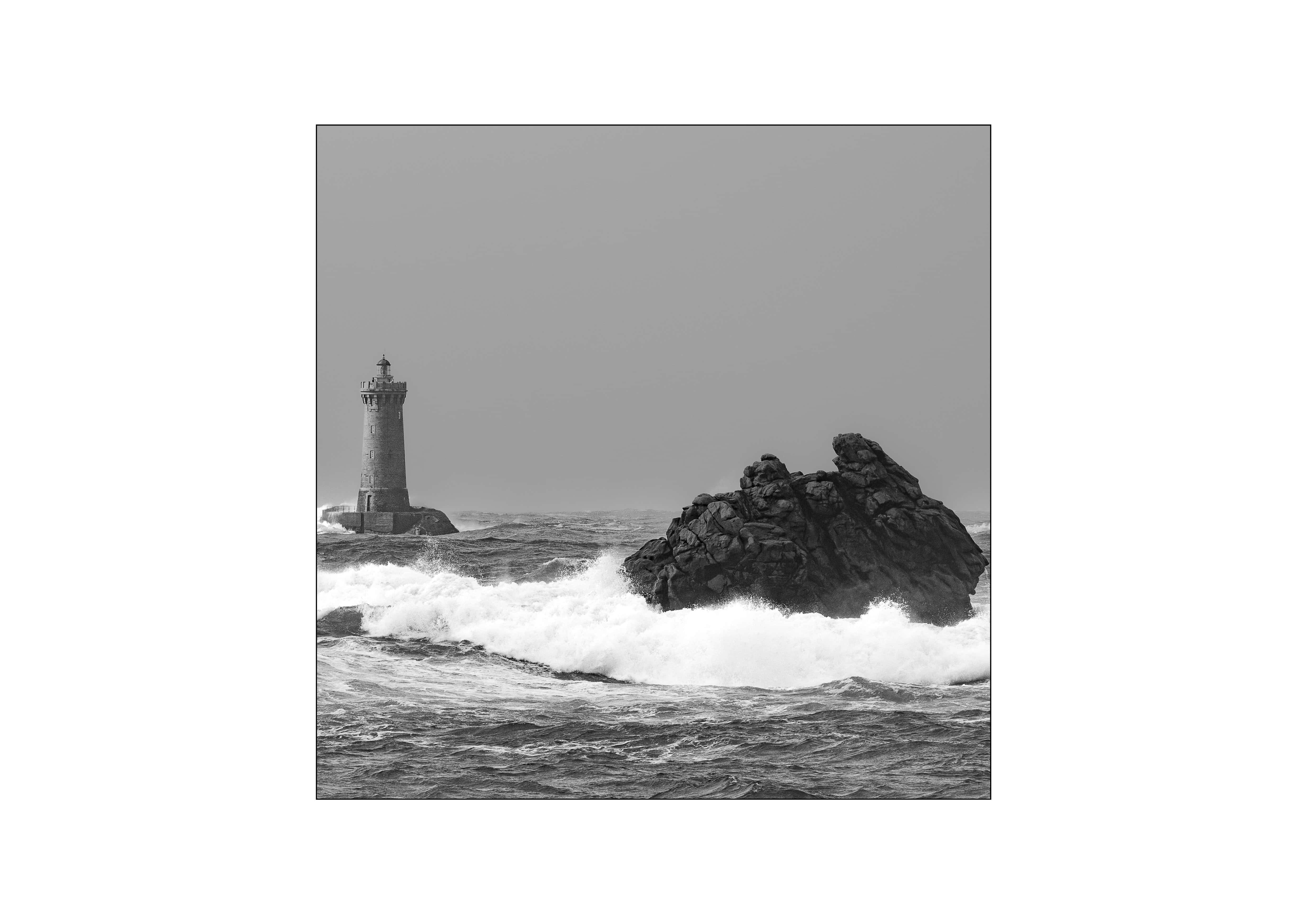
Black and white abstracts. It strips away the descriptive layer — the “this is a green field, that is a blue sky” — and forces everything down to structure, tone, light and form. What survives that reduction is what the image was really about: the shape, the weight, the texture, the geometry of the thing.
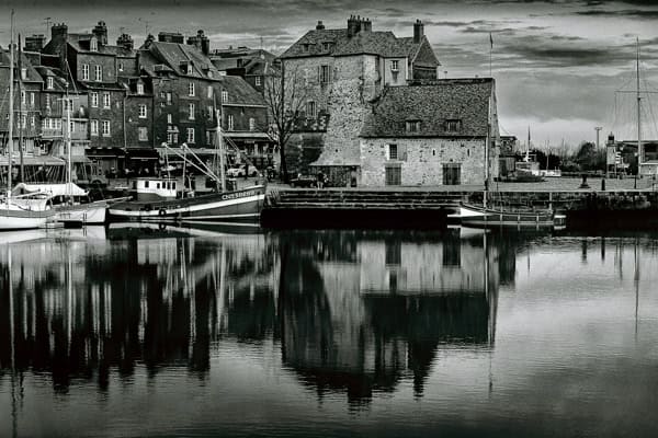
This is why it suits granite, storm-water, raking light on stone, the architecture of a wave. It is also why it reads as timeless — remove colour and you remove most of the cues that date a photograph or tie it to a specific afternoon. You’re left with something closer to memory than to record.
Michael Kenna is the reference point here, and a clarifying one. He works almost entirely in black and white, often in square format, frequently with very long exposures, in mist and rain and low light. His own reasoning is worth repeating: he finds black and white more mysterious because we see in colour all the time — it’s quieter, one step removed from the everyday. His subject is rarely the description of a place. It’s its atmosphere, its residue, the memory of presence. That’s exactly the territory where monochrome outperforms colour.
My three series — Memory of Granite, The Fury and the Grace, Atlantic Silences — live in that territory. They are not trying to describe the Atlantic coast. They are trying to distil something essential and lasting from it. Colour would add information those images don’t want. So they stay in black and white. That’s a deliberate artistic choice, not a limitation.
What colour does better
Colour anchors. Where black and white lifts a scene out of time, colour plants it firmly in a particular hour, a particular season, a particular emotional register. It carries atmosphere and warmth in a way monochrome can only gesture at.
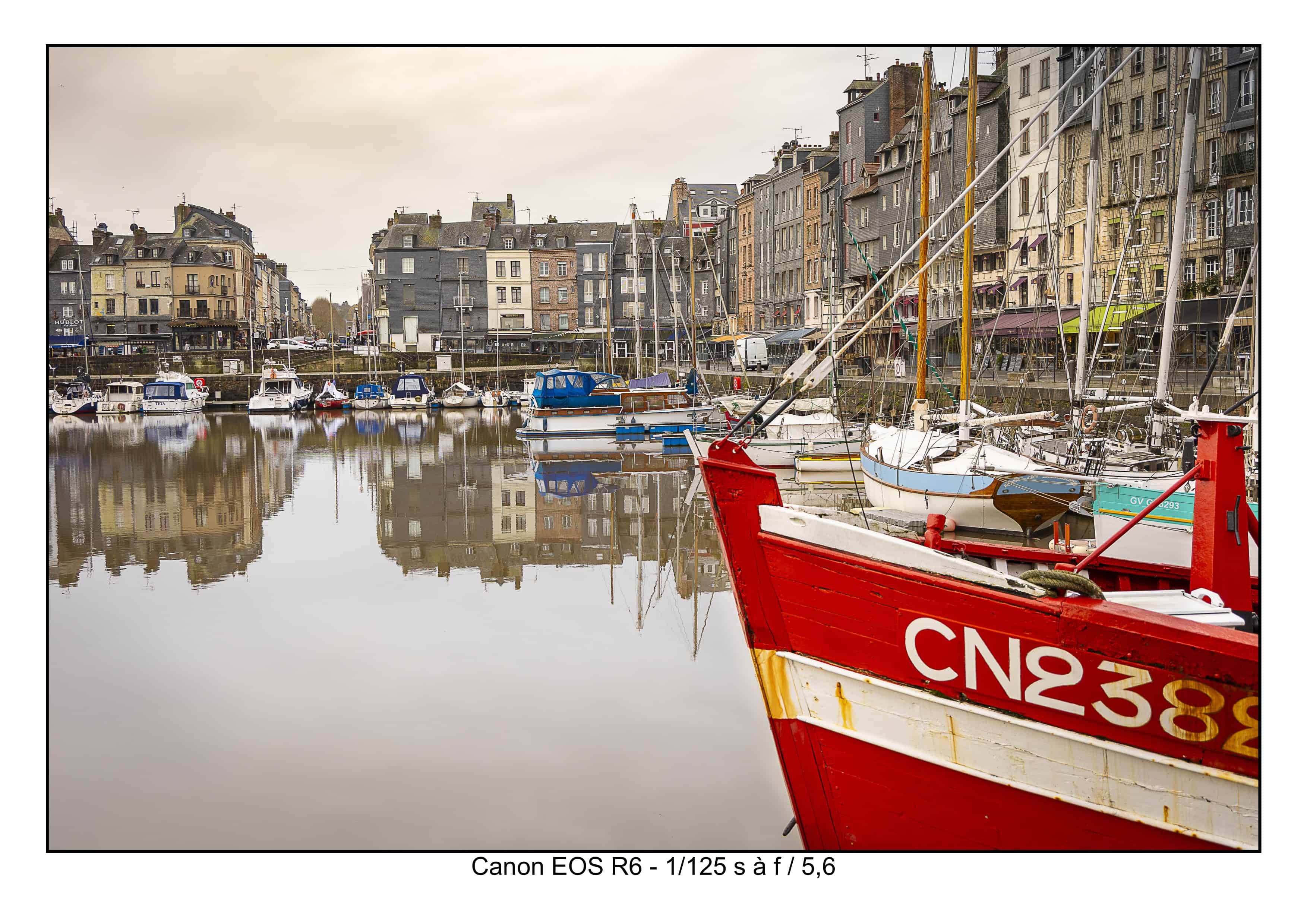
When the subject itself is the colour — a specific quality of evening light, a harmony between a warm foreground and a cold sky, the particular green of the countryside in a certain light — then converting to black and white doesn’t purify the image, it guts it. You’d be throwing away the very thing that made you stop.
Meyerowitz’s Cape Light is the demonstration. Those images — glowing yellows, stormy blues, evening purples across an Atlantic shoreline — could not exist in monochrome. The colour isn’t decoration on top of the composition; it is the composition. Strip it out and there’s no picture left.
So when a landscape’s meaning is carried by its atmosphere rather than its structure — the inland countryside, a soft warm end-of-day light, a chromatic harmony that is the point — I shoot it in colour, and I don’t apologise for it.
My decision grid
Here is what actually runs through my head in the field. I try to answer these before I release the shutter, not afterwards at the editing desk — because deciding after the fact usually means I didn’t have a reason either way.
Does colour add meaning, or only information?If the colour is just telling you what things are — grass is green, water is blue — it’s information, and black and white will probably make a stronger image. If the colour is carrying feeling or holding the composition together, keep it.
Is the subject the form, or the atmosphere?Structure, texture, geometry, the weight of things → black and white. Mood, light, warmth, the emotional temperature of a moment → colour.
Is the palette harmonious, or is it noise?A scene with a clear, limited, harmonious palette can be transcendent in colour. A scene with clashing, distracting colours often resolves beautifully in monochrome — black and white is a very effective way of silencing visual noise.
Do I want the moment, or the memory?If I want to fix a photograph to a specific, unrepeatable instant, colour holds that instant. If I want something that feels outside of time — closer to how a place lives in memory than how it looked on Tuesday — black and white gets me there.
None of these is a rigid rule. But together they usually make the decision for me before I’ve even framed the shot.
When I genuinely can’t decide
Sometimes I don’t know. The scene could go either way, and I refuse to pretend otherwise. When that happens, I shoot to preserve the choice — expose so that both a strong colour and a strong monochrome interpretation stay possible — and I resolve it later, deliberately, at the print stage.
I mention this because the confident version of this article (“I always know instantly”) would be a lie, and lies don’t teach anyone anything. Forty years in, I still hesitate. The difference experience makes isn’t that the doubt disappears — it’s that I know what questions to ask to resolve it.
One eye, two languages
So: is Photovag a black-and-white photographer who occasionally does colour, or a colour photographer with black-and-white series? Neither framing is quite right, and that’s the point.
There’s one photographer here, with one pursuit — to receive the beauty a place offers rather than impose a formula on it. Black and white and colour are simply two ways of speaking that beauty, and I choose between them according to what I’ve been given, not according to a brand rule or a genre expectation.
Black and white remains my centre of gravity. It’s where my series live and where my deepest work happens. Colour is a possibility I hold open, deliberately, for the scenes that ask for it. The medium follows the seeing. It has always been that way round.
The photograph is not taken. It is received — and part of receiving it is listening for the language it wants to be spoken in.
To see the work discussed here, visit the artists’ own sites: Michael Kenna and Joel Meyerowitz. All images on this page are my own.
Leave a Reply